


-
Client: AT&T
Role: ECD / Creative Director
Scope: Lead design, digital and mobile interactive experiences and games, themed environments, graphic and digital media
Agency: Twenty Four 7
Location: AT&T flagships - Chicago, Dallas, San Francisco
Overview: Fandom is our guiding light when creating activations for popular IPs like this one to promote the premiere of WB’s Space Jam: A New Legacy. The enthusiasm of the fans informs content curation and design objectives. Most importantly, by tapping into personal passions and communities of interest, these store takeovers attract a wider range of consumers to the flagship doors and to the AT&T brand.
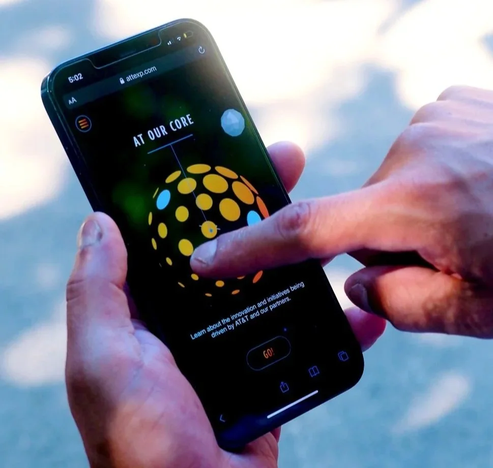
It was imperative during COVID restrictions to design the experiences in a way that could easily be retooled for mobile. Space Jam content became the headliner for a broader project (ATTEXP.com) where we developed a custom entertainment platform for mobile from the ground up, giving consumers unlimited access to dozens of digital games, including AR experiences and personalized content creation.
The project was a finalist for the Comm Arts Interactive Award in the Environmental category.


-
Client: My TOIbox
Role: ECD / Creative Director / Content Creator
Scope: Lead project creative team from concept through launch of all-new digital platform for mobile, including interactive experiences, game templates, and brand/identity
Agency: Twenty Four 7 / My TOIbox
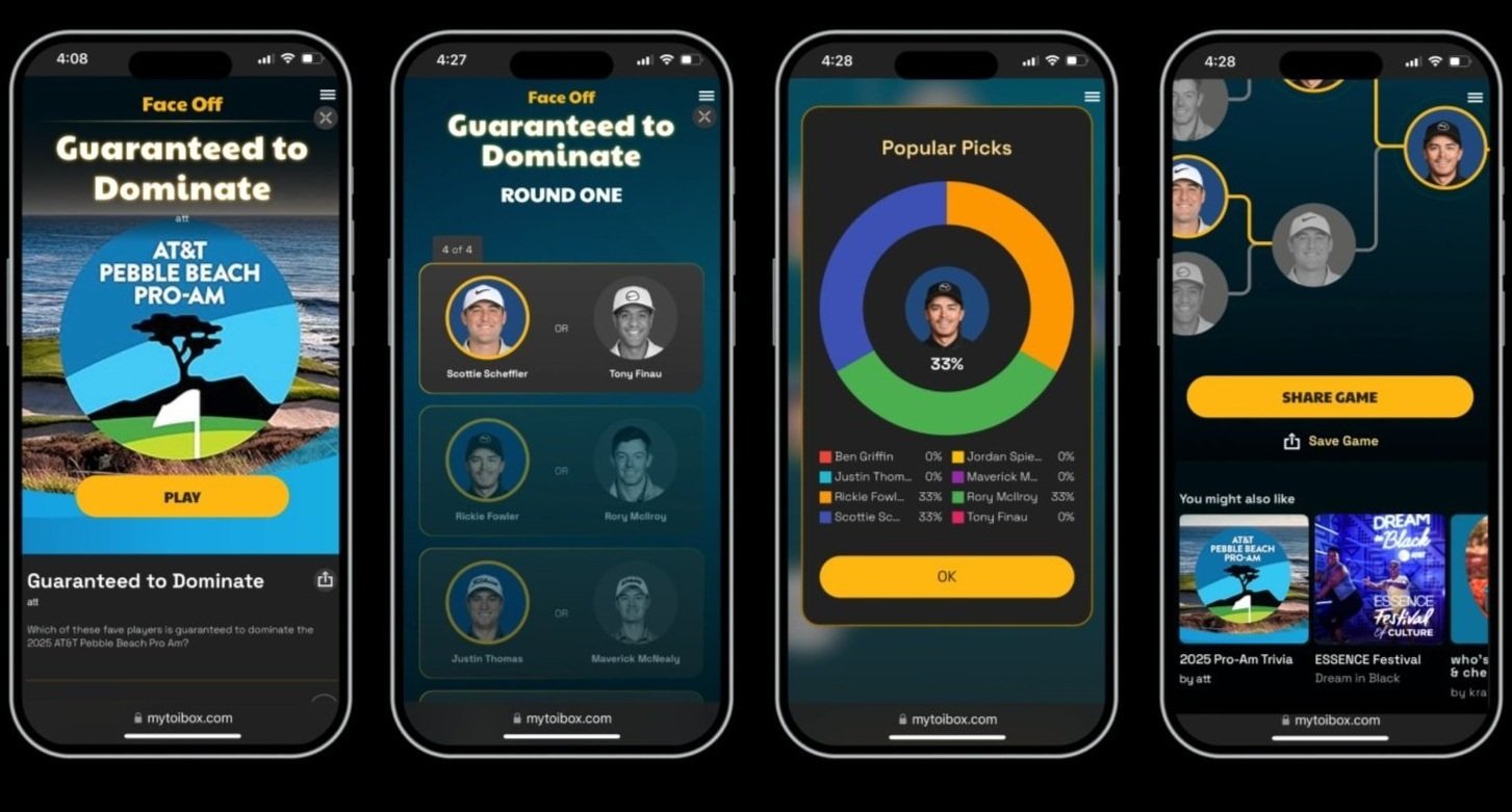
Overview: My TOIbox is an all-new platform that creates meaningful connections through playtime. This digital play space is for active vs. passive engagement, where game-based templates add dimension to existing content and allow easy integration with social marketing channels and campaigns. As a hub, My TOIbox invites a deep dive into everything a brand has to offer - without delay or interruption.
Years of designing consumer experiences showed us again and again that brands need easy-to-use digital engagement tools that create more meaningful ways to connect with their audiences - to get more than mere seconds of attention. Our goal is (many) minutes of engagement vs a few seconds. The data is proving that My TOIbox is doing just that, and more.
My TOIbox was designed from the ground up, with all development and production done in-house. The platform integrates AI technology, analytics tools, and is built primarily for use on mobile devices. It will launch Q2 2025.


-
Client: AT&T
Role: ECD / Creative Director
Scope: Lead design, digital interactive experiences and games, themed environments, events, graphic and digital media
Agency: Twenty Four 7
Location: AT&T flagships - Chicago, Dallas, San Francisco
Overview: This transformation of AT&T flagship stores celebrated the premiere of the final season of HBO’s series Game of Thrones. The project included conceptualization and design of numerous fandom experiences, digital interactives, themed environments, displays of original costumes and props, and unique events like a fashion show hosted by Olympic figure skater and fashionista Johnny Weir. The overall collection of experiences provided fans of all levels with a variety of activities, exclusive content and immersive interactions.
During our research phase, we discovered that new audiences faced the daunting task of getting caught up on the previous 7 seasons. To help them, we created a digital countdown clock with a unique binge calculator where users could adjust content to their viewing habits and output personalized binge schedules.
Integration of AR and VR technologies brought physical environments to life with seamlessly calibrated 3D digital content. These experiences included The Dead Must Die, an augmented reality interactive created in partnership with Framestore and Magic Leap, and Beyond the Wall, a 4D VR interactive created in partnership with Framestore.
Additional experiences included:
• An interactive map Westeros
• A digital community board where fans shared their predictions for the final season and voted for their favorite characters and scenes
• Go Behind the Scenes explorable digital media archive
• Themed Throne Room where fans could capture their selfie moment on a full-scale reproduction of the Iron Throne
• Original costumes and props on display
• Themed Watch Lounge
The Game of Thrones Season 8 activation won numerous awards including the AEAF for TheDead Must Die AR experience. The Beyond the Wall VR experience was nominated for an Emmy and a Webby Award.




-
Client: AT&T
Role: ECD / Creative Director
Scope: Lead design, digital and mobile interactive experiences and games, themed environments, graphic and digital media
Agency: Twenty Four 7
Location: AT&T flagships - Chicago, San Francisco, Dallas
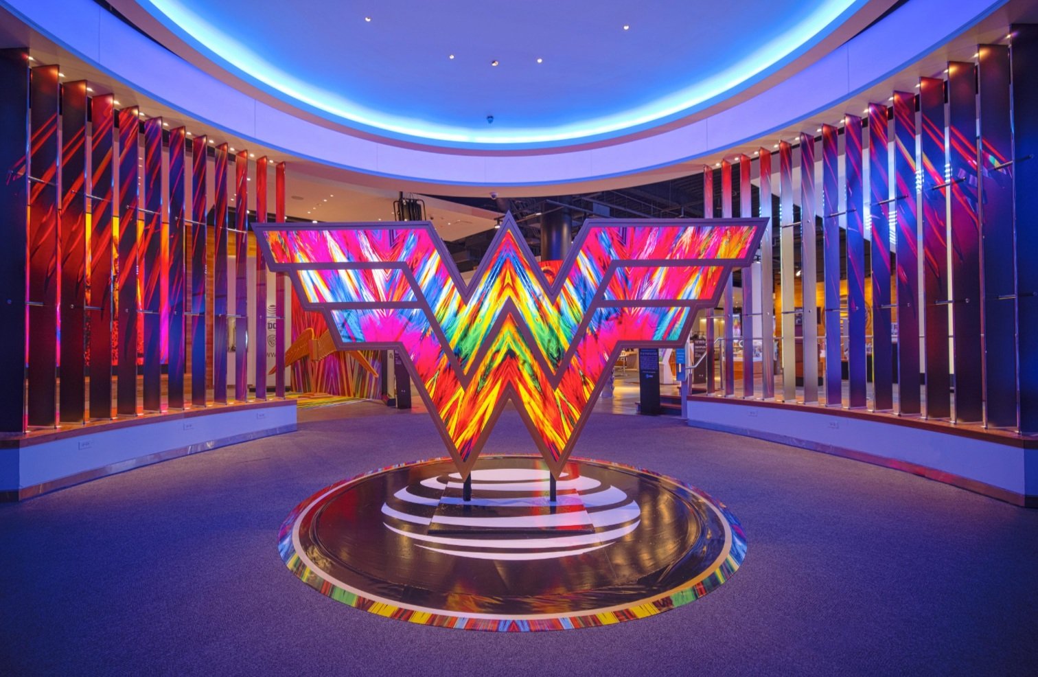
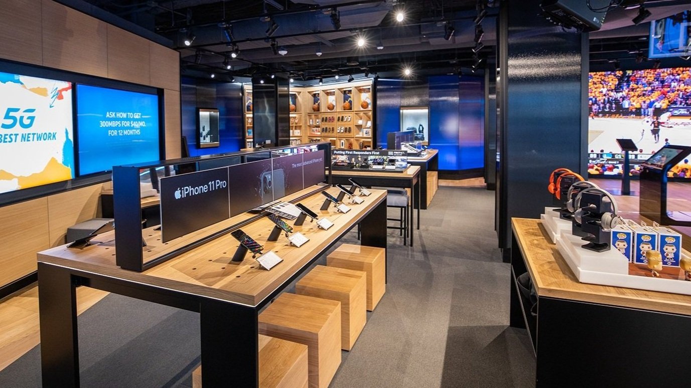
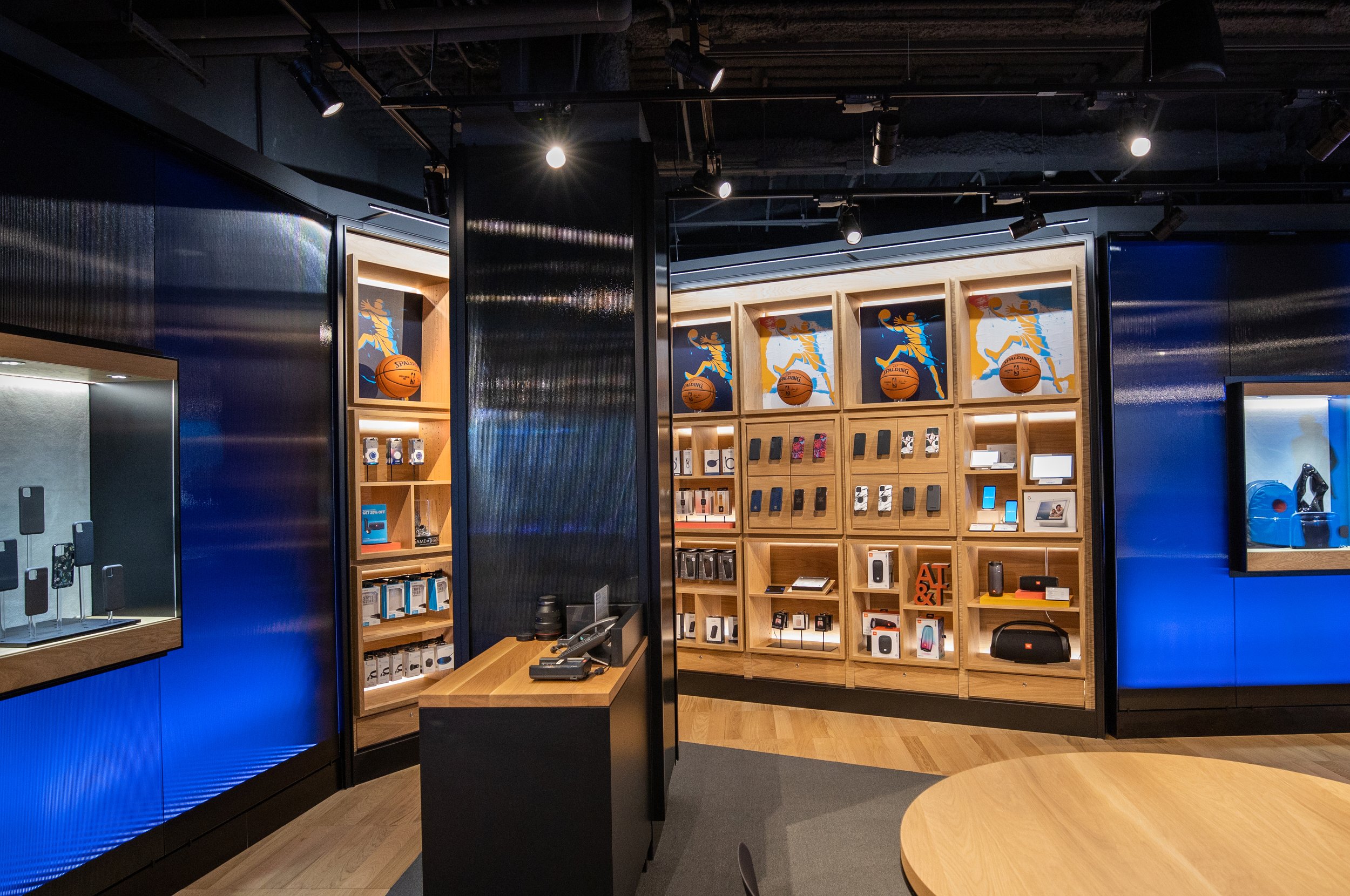
Overview: Following the success of activations we created for the premiere of WB’s film Justice League, we transformed AT&T flagships into immersive Wonder Woman experiences that captured the excitement of the premiere of Wonder Woman 84.
The in-store experiences were designed to give both DC Comic fans and the general consumer an inspiring entertainment destination. For those who were not up to date on Wonder Woman’s modern iteration, we included a number of historical elements, such as a digital trivia quiz, iconic vintage memorabilia, and a table-top touchscreen interactive that let users browse every Wonder Woman comic book ever issued. These throwback experiences also provided broader IP-related content without divulging details about the new movie.
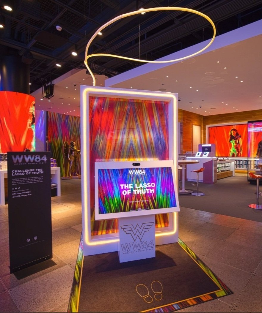
Other elements of this activation included a motion-tracking digital wings experience, a digital Lasso of Truth game, original costumes and props, and unique selfie moments.
The project won numerous awards including the VMSD International Visual Competition, an Addy, and a CLIO Award.



-
Client: AT&T
Role: ECD / Creative Director
Scope: Store/retail design, digital interactive design, content development, consumer experience and environment design, graphics and digital media
Agency: Twenty Four 7
Location: Dallas, Texas
Overview: For 10 years, I have worked with AT&T flagship stores to create pinnacle consumer experiences that attract diverse audiences to the brand and deliver compelling content about AT&T’s legacy as an innovator and as a supporter of social causes like PRIDE and AT&T Dream in Black’s program Black Future Makers.
During this period, we evolved AT&T flagship to become a media extension with a strong brand halo effect, combining tech, culture and entertainment. The AT&T Experience Store, at AT&T Discovery District in Dallas, which I designed in 2020, was an evolution of social commerce moving into the realm of media. The highly experiential store, which devoted 75% of its space to experience, and 25% to product, is designed for changeability - to support continual refinement and innovation, and to provide flexibility for frequent rotation of content, multimedia experiences and events.


-
Client: AT&T and Warner Bros Television
Role: ECD / Creative Director
Scope: Lead design, digital interactive experiences and games, themed environments, stunts and events, graphic and digital media, and exclusive merchandise
Agency: Twenty Four 7
Location: AT&T flagships - Chicago, Dallas, San Francisco, and various other venues including Las Vegas, New York, Seattle, LA and Chicago’s Field Museum
Overview: As part of the franchise’s 25th anniversary, we worked with AT&T and with Warner Bros to create a suite of live events and fun in-store experiences for all levels of Friend’s fandom. The scope of work was extensive and included: a complete set recreation of the iconic Central Perk Café, an interactive Monica’s apartment, a digital ‘tech’ timeline with series highlights, displays of original costumes and props, a take-over of the ‘Brooklyn Bridge’ on the Las Vegas Strip, ‘Friends Giving’ gala events, a street take-over event, and a Phoebe look-a-like stunt in New York City, which concluded with a live appearance on NBC’s TODAY show.
The activation earned numerous industry accolades and awards including 10 CLIOs.



-
Client: AT&T
Role: ECD / Creative Director
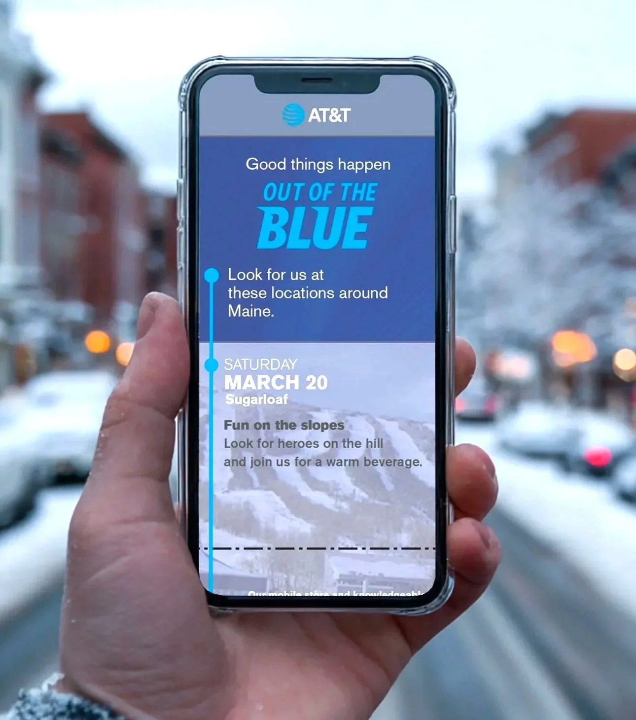
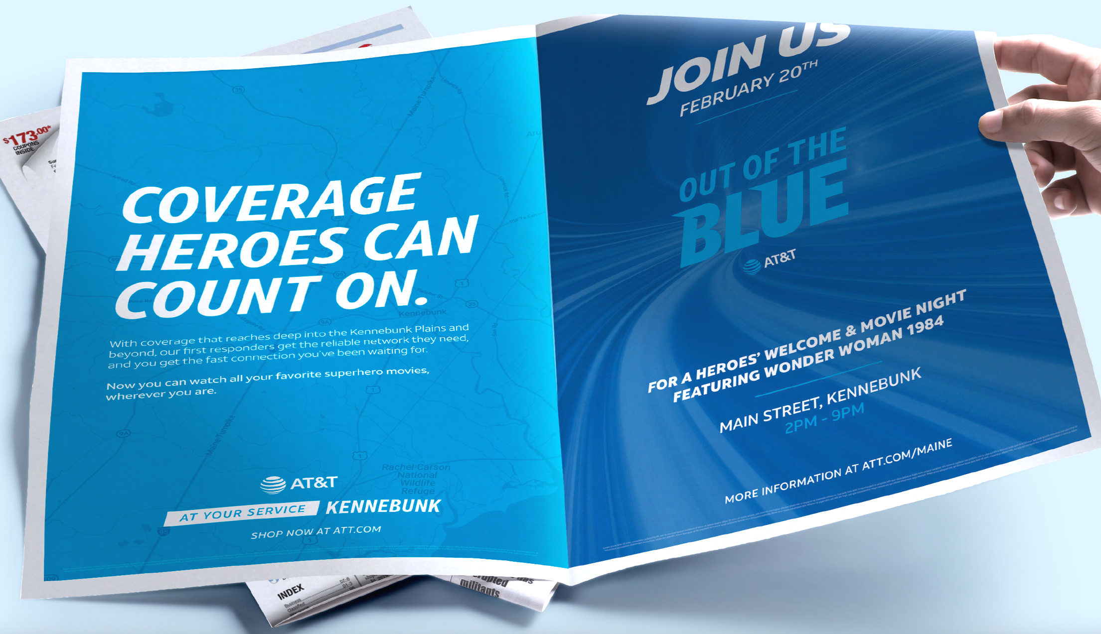
Scope: Strategy, campaign identity, tag lines and copy, graphic design, a campaign-specific micro-site for mobile, animations and illustrations of coverage maps, design, planning and execution of activation events and special on-the-spot discount offers at local businesses, and concept, development and production of radio spots, social posts, print ads and more.
Agency: Twenty Four 7
Location: Maine, New England
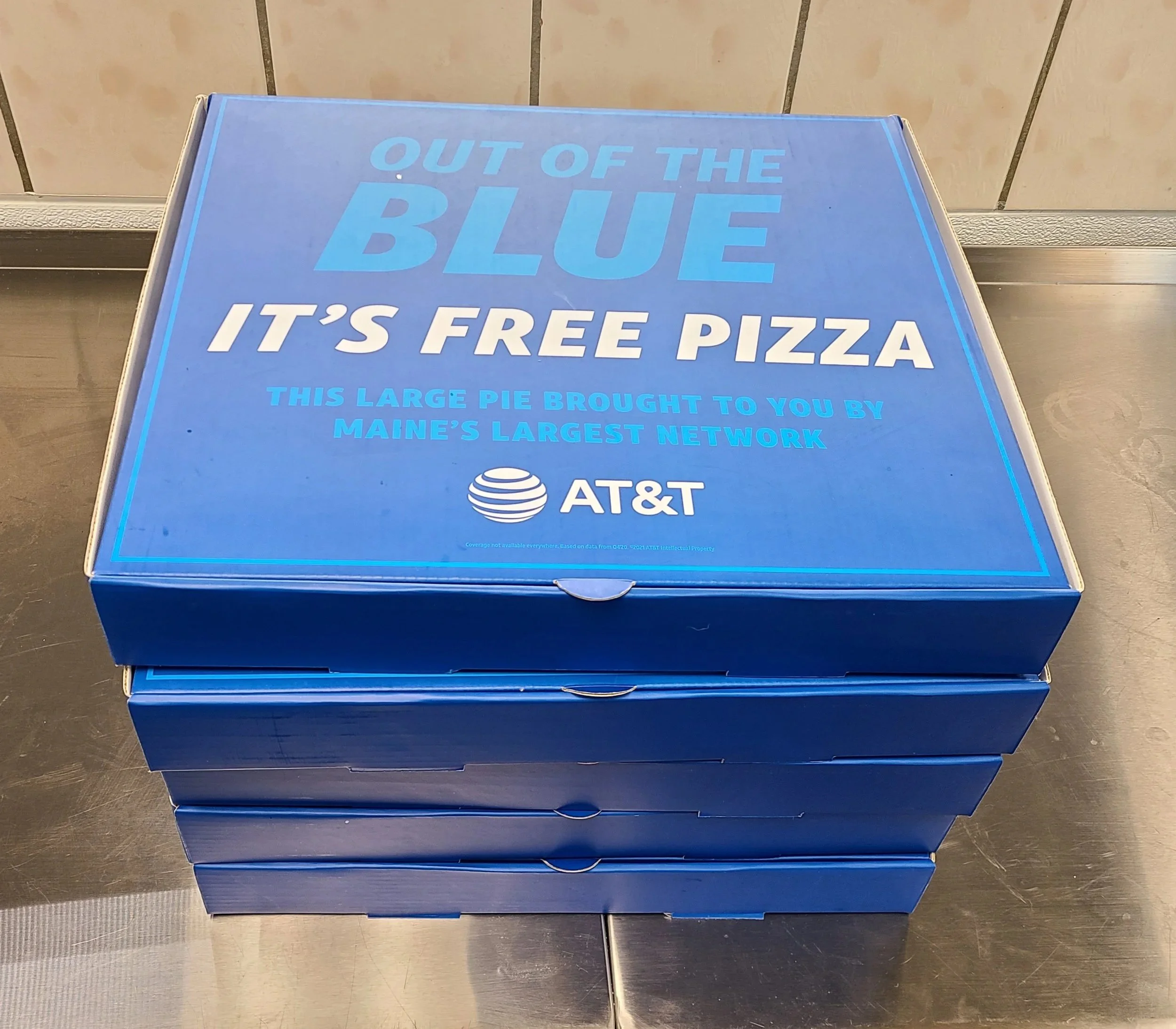
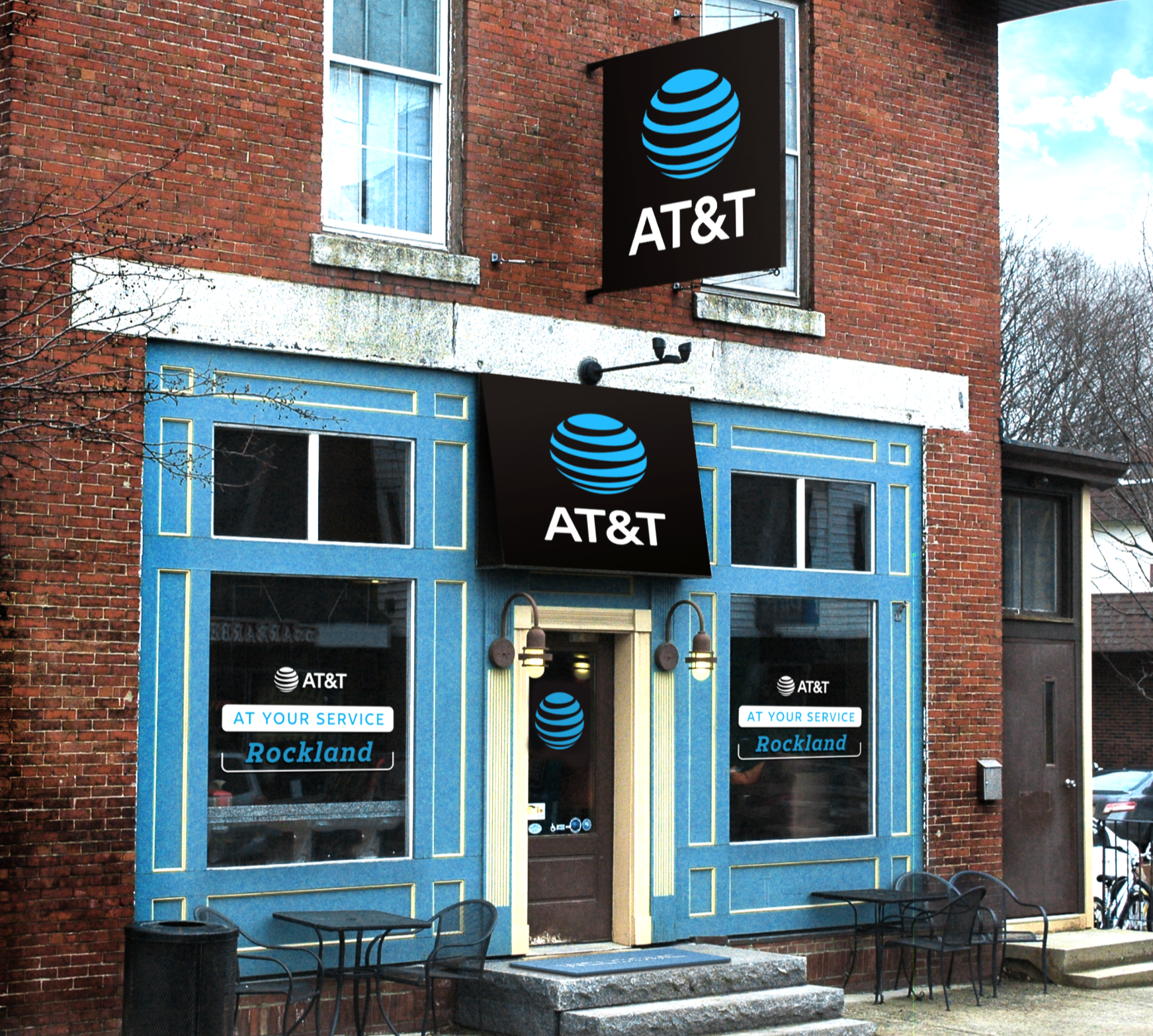
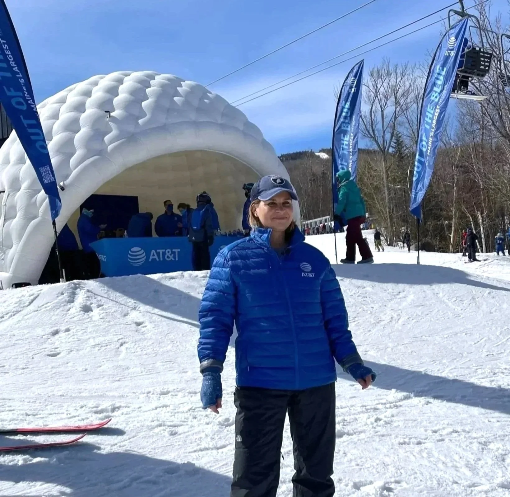
Overview: Cell phone coverage in parts of New England was known to be spotty. For years, vast areas of Maine had no coverage. AT&T was about to change that with the roll-out of an upgraded and expanded cell network. It was time to get the word out and meet Mainers everywhere they go with things they’d love. And because good things are even better when they're a surprise, we delivered the unexpected, right OUT OF THE BLUE.
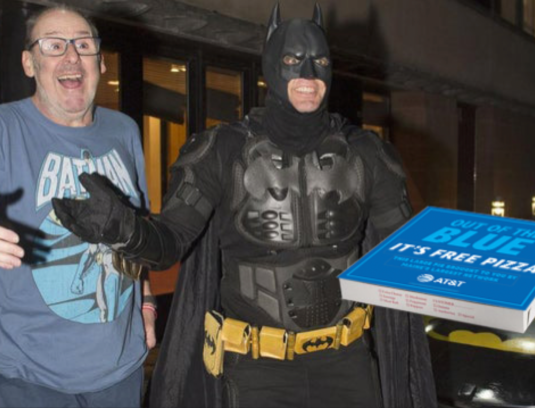
Working in close collaboration with our strategy team at Twenty Four 7, I led the creative team in building the strategy and concept, developing the campaign identity and taglines, and implementing a comprehensive omni-channel direct-to-market campaign. ‘Out of the Blue’ expressed AT&T’s commitment to connecting towns and communities throughout New England via a series of surprise encounters in unexpected places - like Batman showing up on your doorstep to deliver your pizza, for free, or a complimentary hot beverage on the cold slopes of your favorite ski resort.
Key messaging also leveraged AT&T’s partnership with First Responders Authority Network (FirstNET) in New England, AT&T’s commitment to first responders and their families, and the excitement of iconic WB superheroes.





-
Client: AT&T
Role: ECD / Creative Director
Scope: Digital interactive design, content development, consumer experience and environment design, activation identity, graphics and digital media
Agency: Twenty Four 7
Location: AT&T flagships (Dallas, San Francisco, Chicago)
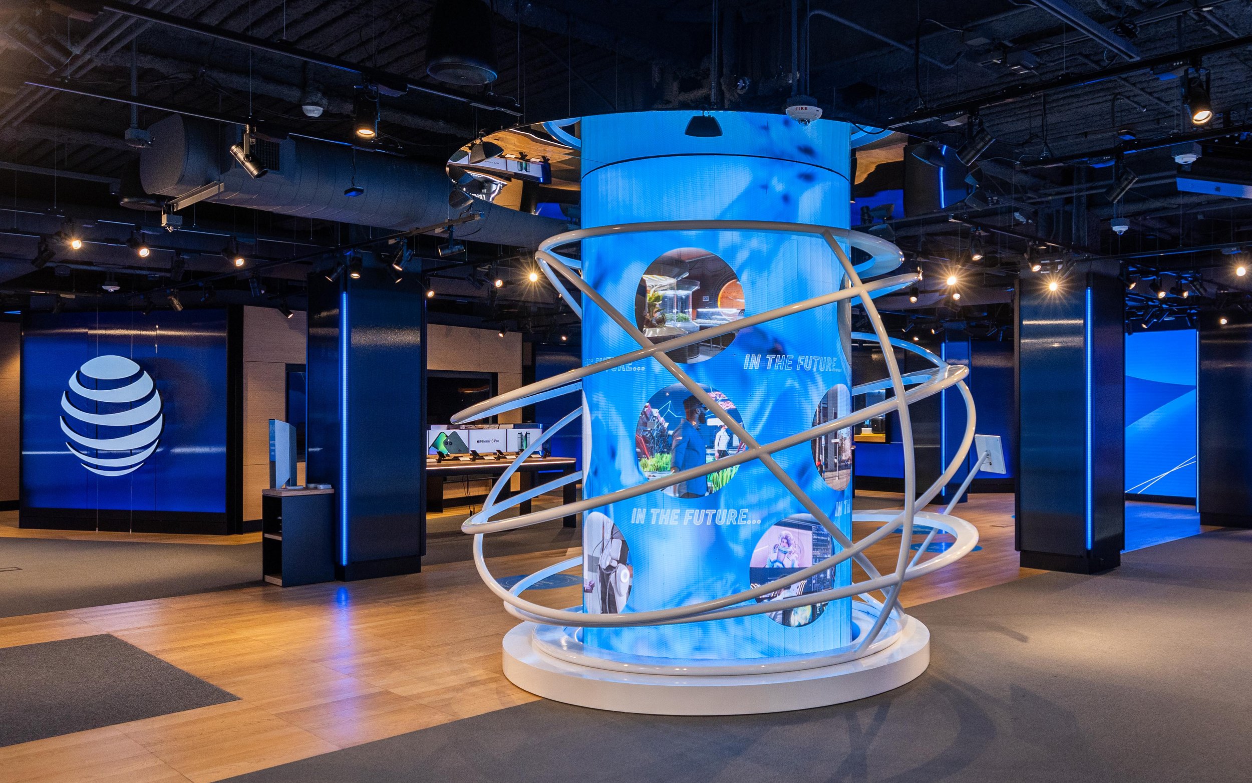
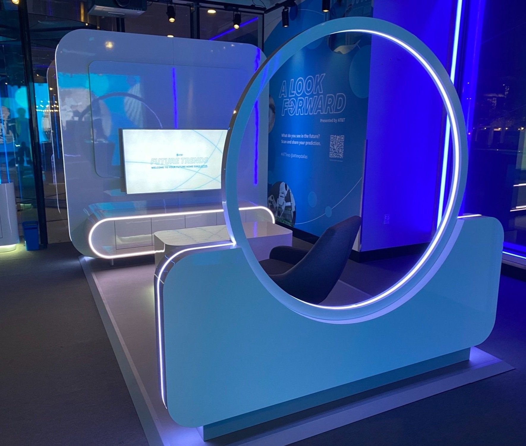
Overview: Research showed that a considerable number of consumers are wary of the future and apprehensive of new technology. Especially after Covid, trepidation about the future has grown. For a tech company like AT&T, leading the conversation about innovations like 5G, in aspirational, informative and inclusive ways, is essential for promoting consumer trust and confidence.
What could the future be?
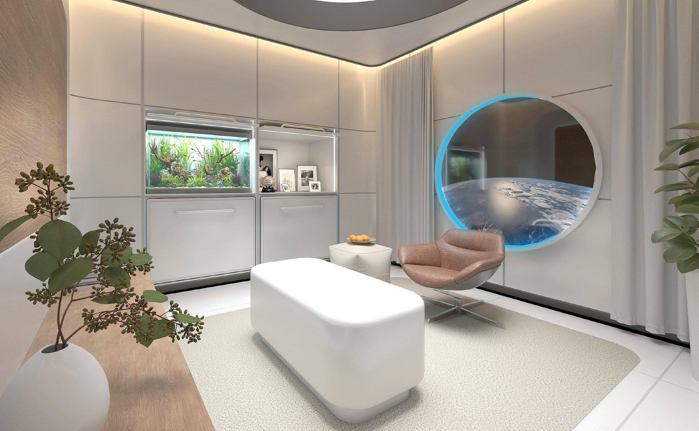
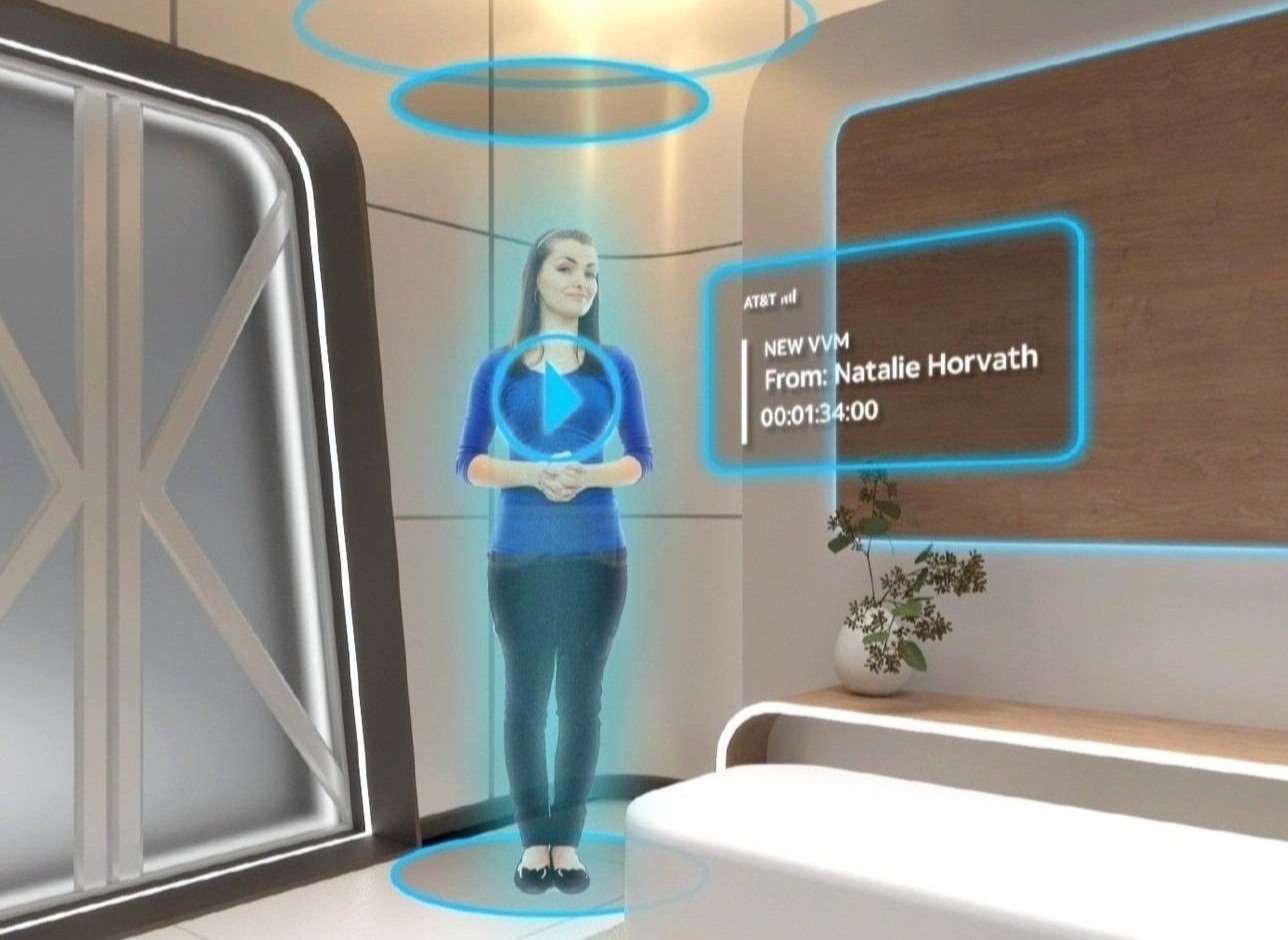
A Look Forward helps enlighten this question by providing an approachable, hands-on peek at near future technology, how it may improve our lives, and how AT&T innovations are paving the way. Part educational, part inspirational, a collection of interactive digital experiences invites visitors to explore and consider their place in that future, to share their predictions, and to decipher the meaning of cryptic tech terminology. And via interactive VR, consumers can visit their future apartment - aboard a space station!


-
Client: National September 11 Memorial Museum
Role: Design Director / Lead Designer
Scope: Lead exhibition design
Agency: Thinc Design
Location: New York, NY
Size: 110,000 sqft
Overview: The National September 11 Memorial and Museum sits within the footprints of the World Trade Center towers, below the Memorial plaza. The exhibits honor the victims of the attacks, and tell the hundreds of personal stories from that harrowing day.
Working on this project was an emotional process, as many on our design team had experienced the events first-hand. Our close collaboration with the museum team included curation of numerous artifacts large and small. We sifted through thousands of personal belongings, family photos, eyewitness videos, and media outlet broadcasts. And we listened to dozens of phone call recordings, voice mails and emergency responders’ communications. 9/11 was the most recorded catastrophe of our time.
The exhibits present visitors with an unbiased account of the controversial events. They serve as a national archive, while being respectful of the victims and their families. And they allow space for visitors to consider the evolving narratives that will be interpreted and reinterpreted for generations.
The project has won numerous awards including the Core77 Design Award, the IDEA Award, the THEA Award, and numerous Muse Awards.



-
Client: Johnson & Johnson
Role: Design Director / Lead Designer
Scope: Exhibition Planning and Design, Visitor Experience, Signage and Exterior Elements
Agency: Thinc Design
Location: Olympic Summer Games, Beijing, China
Size: 24,000 sqft
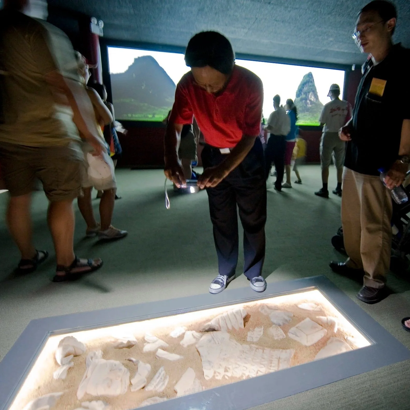
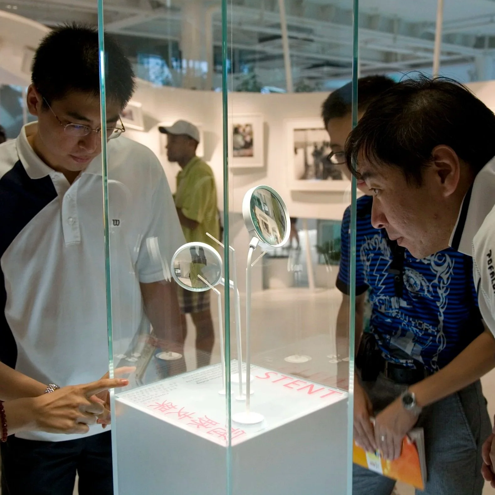
Overview: The Johnson & Johnson Olympic Games Pavilion was an expression of J&J’s commitment to caring, and to all those who are caregivers. The exhibition included both analog and digital media demonstrating the many ways that we care for each other and for our shared world. It also featured examples of J&J’s newest healthcare technologies, their services and products for caregivers, and their cultural commitments, like their enduring work to help preserve and protect the famous Qin Shi Huang Terracotta soldiers from damaging fungi.
-
Client: Backcountry
Role: ECD / Creative Director
Scope: Retail/brand strategy, lead design, retail environment, fixtures and interactive experiences
Agency: Twenty Four 7
Location: New York, NY
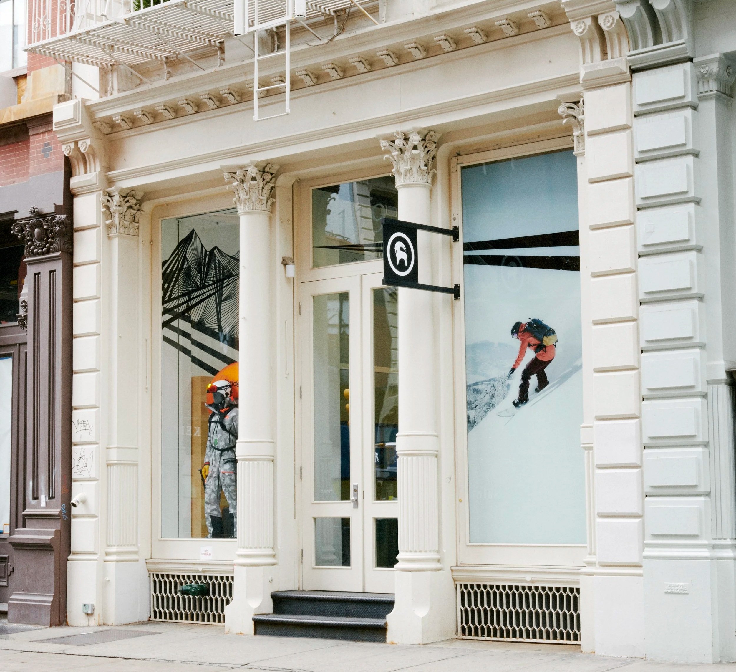
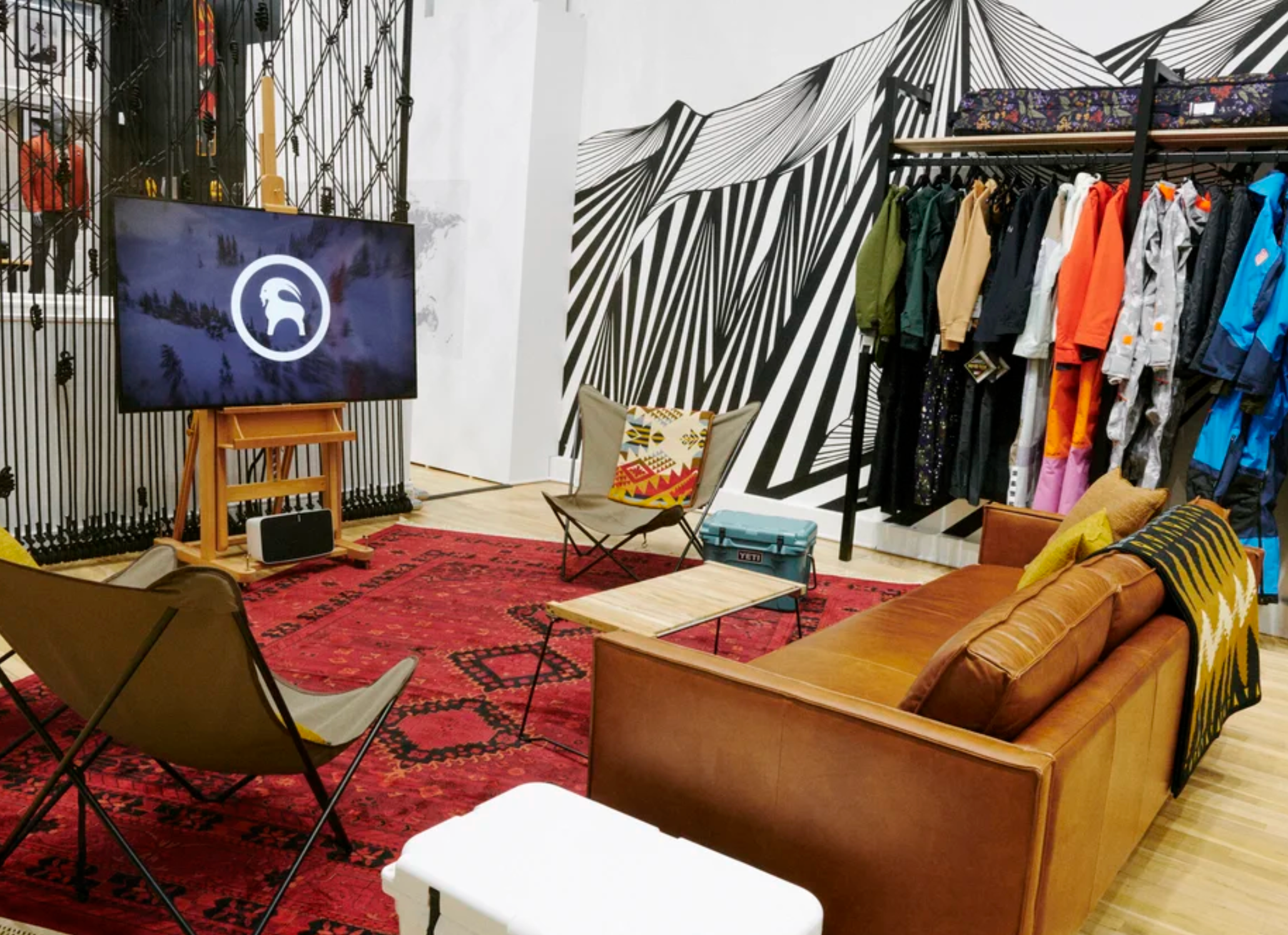
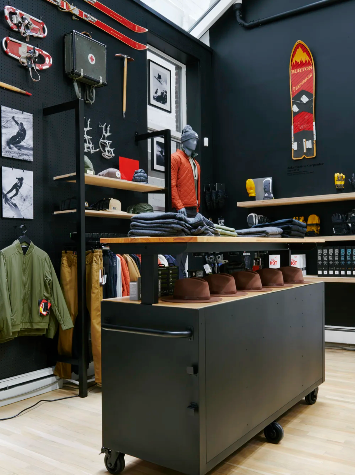
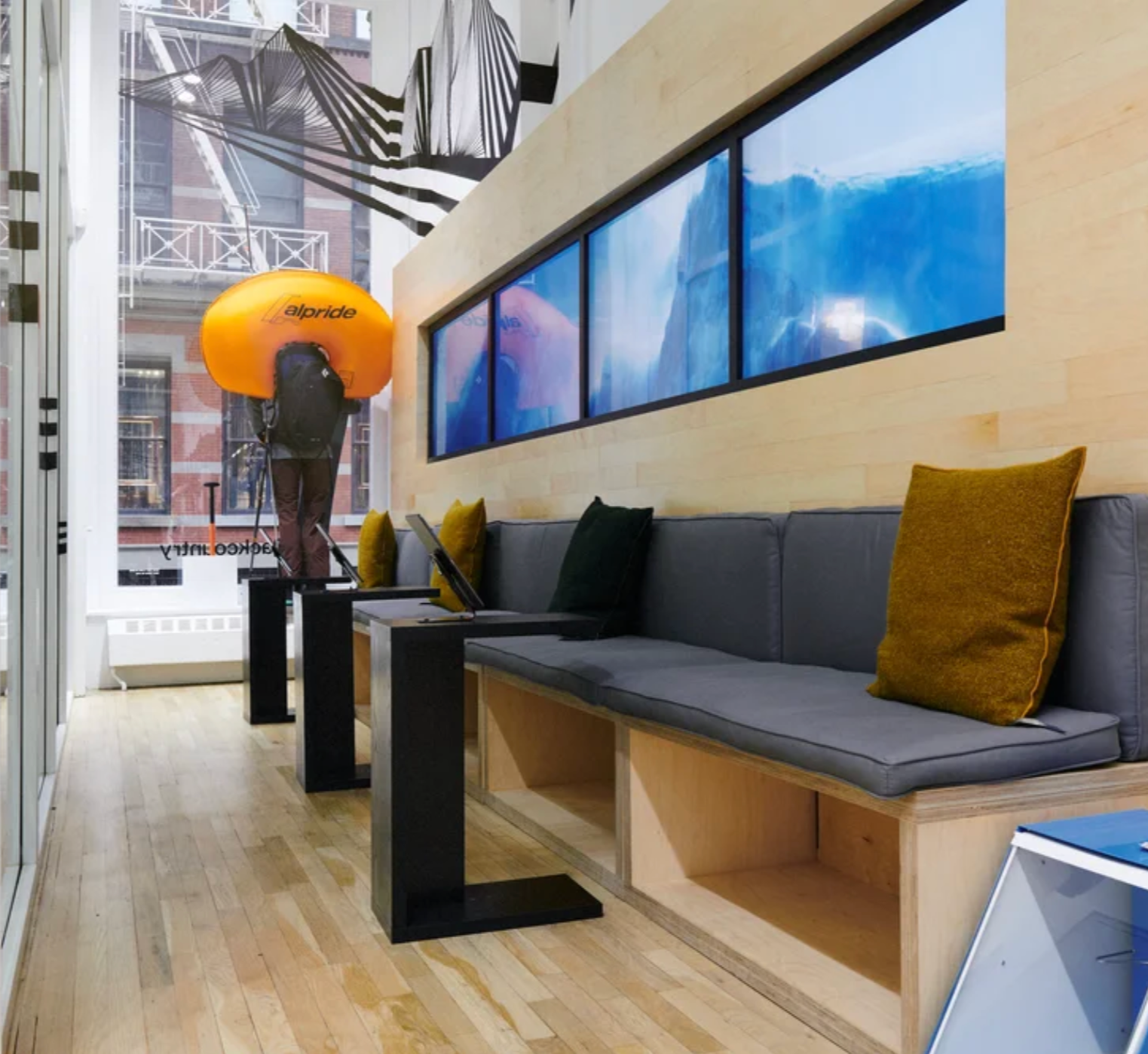
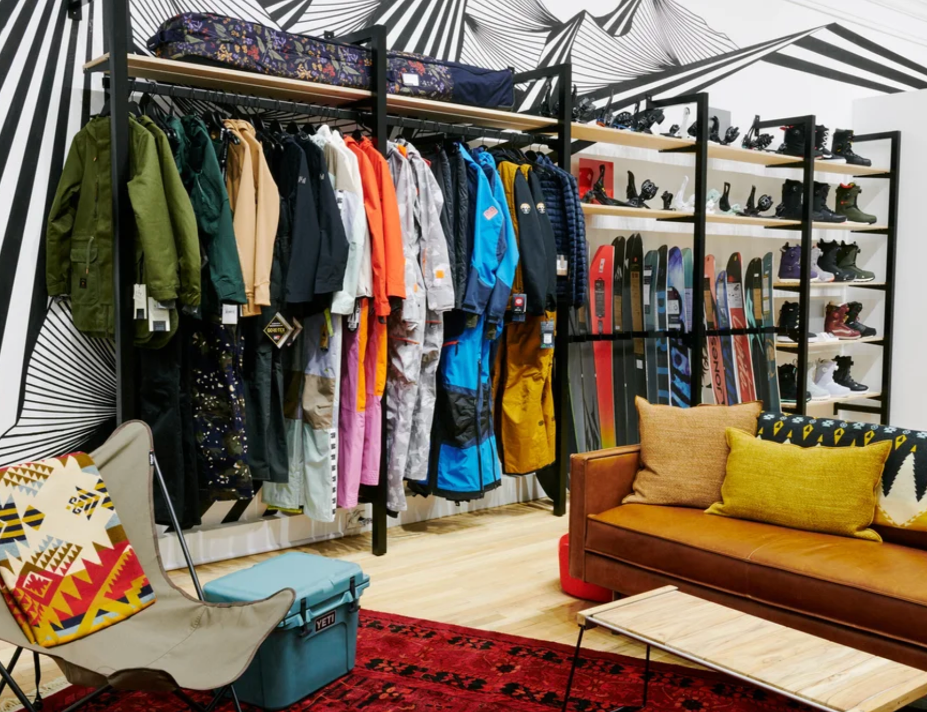
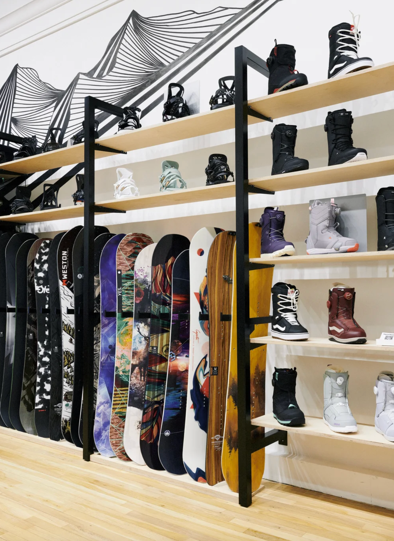
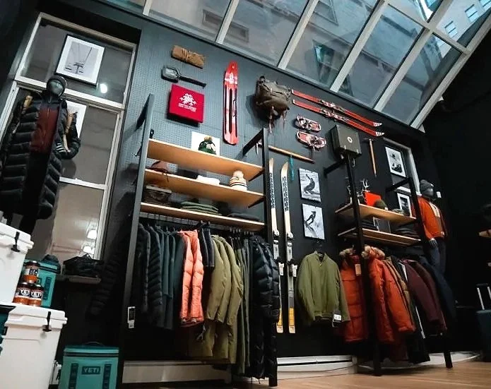
Overview: This 3 month pop-up shop in the heart of SoHo gave urban outdoors fans, who only ever ordered Backcountry products online, a chance to express their shared passion for winter sports and adventure in person.
The entire experience was designed to give customers a place to talk shop with Backcountry's Gearheads, who serve as a combination of outdoor experts, gear enthusiasts and customer service team members. Comfortable seating areas with a laid-back vibe, accessible curation of featured gear and Gearhead faves, and interactive experiences facilitate conversations, invite consumers to share their stories, educate shoppers and help Gearheads provide a concierge level of service as they offer advice on anything from gear to trip destinations and favorite slopes. Overall the space put an emphasis on brand-building and personal interaction over product offerings and driving sales.


-
Client: AT&T (w/WB and HBO)
Role: ECD / Creative Director
Scope: Lead design, entertainment platform for mobile, digital interactive experiences and games, activation identity, and social campaign strategy and content
Agency: Twenty Four 7
Overview: As COVID changed the landscape of retail and re-shaped consumer behavior, mobile experiences have become a key strategy point in enabling our clients to stay connected with their consumers.
At AT&T flagships, we had great success creating activations that appealed to broad audiences. Our work showed that consumer interaction with their brand could be entertaining, prolonged, and rewarding when experiences were interest-led and connected consumers with the things they loved the most. The challenge was to reinvent flagship experiences at a much different scale – to put it in the palm of your hand.
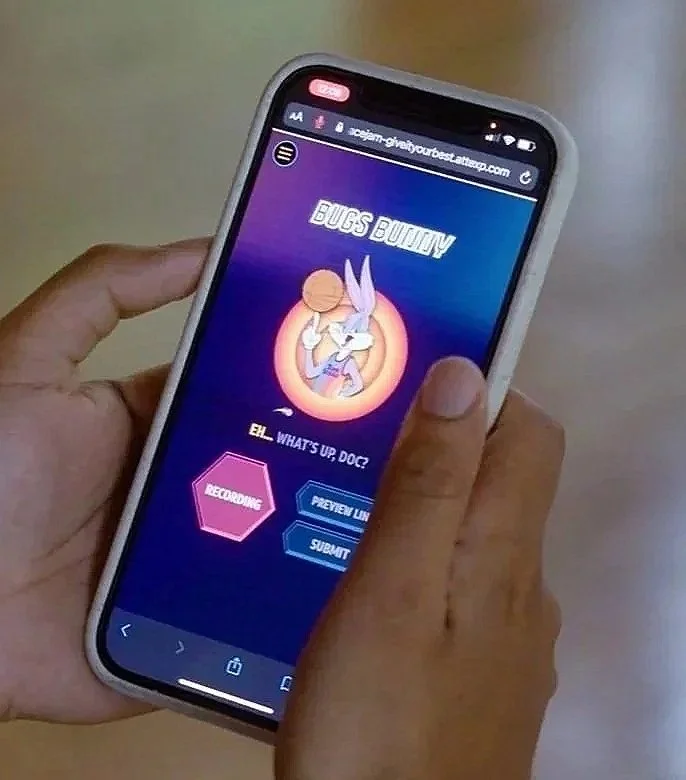
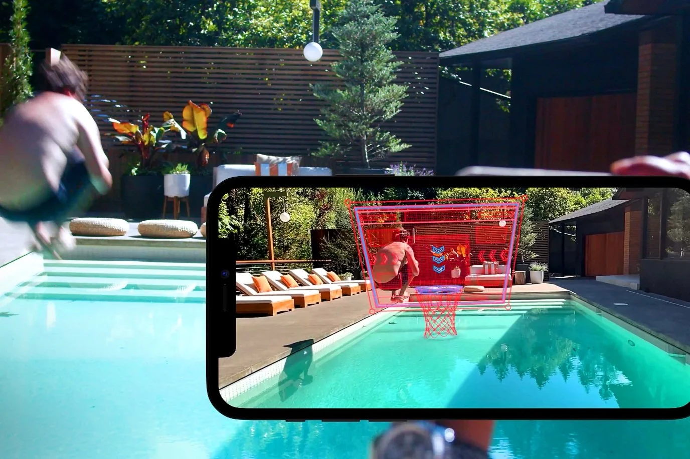
ATTEXP.COM did this and more. It not only provided greater access to more people, anywhere, anytime, it was easily shared. The new custom entertainment platform, developed for mobile from the ground up, supported dozens of unique digital experiences, including AR games and personalized content creation. In addition to brand content and sponsorships, AT&T’s recent acquisition of Warner Media gave the design team access to some of WB’s most popular content.





-
Client: AT&T
Role: ECD / Creative Director
Scope: Digital interactive and game design, content development, consumer experience and environment design, activation identity, graphics and digital media
Agency: Twenty Four 7
Location: AT&T flagships - Dallas, Chicago, San Francisco
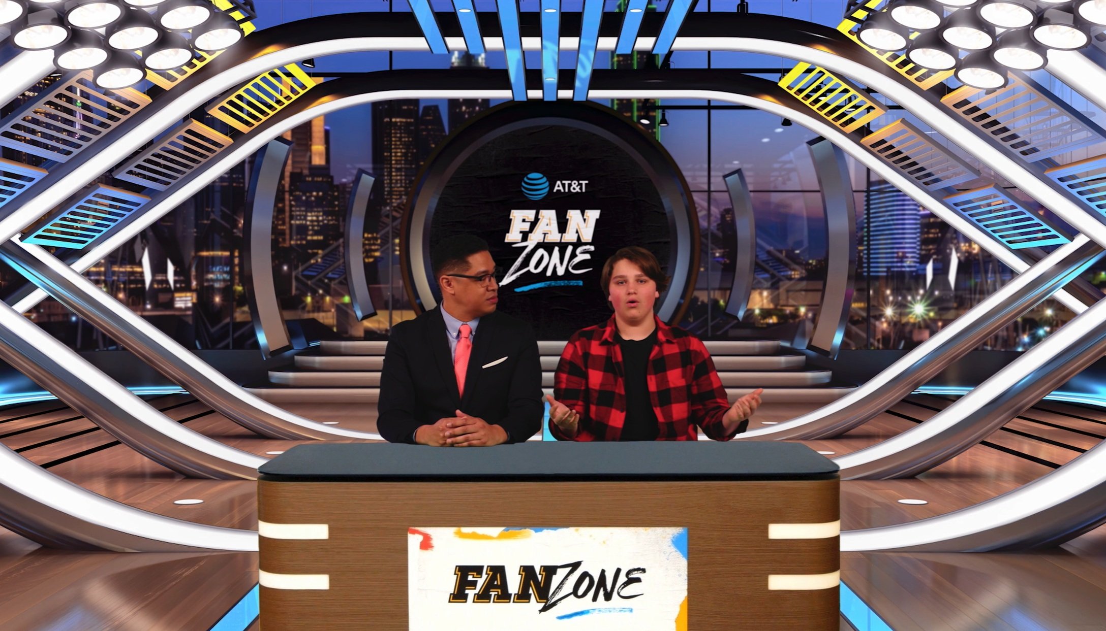
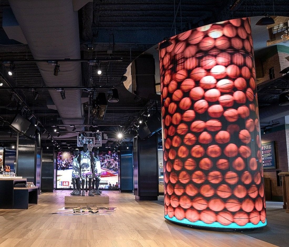
Overview: Fan Zone brought the excitement of AT&T’s basketball sponsorships directly to the fans. The timing of this extensive activation aligned with the playoffs season, when consumer awareness and enthusiasm for the sport is at its height. The design offered a variety of hands-on games, experiences and content designed to appeal to both casual fans and superfans.
At the center of Fan Zone, was a grouping of projection-mapped ‘players’ (mannequins). Video content featured game-action clips and recurring projections of team uniforms that also acted as real-time announcements of the game-day lineups.
Interactive experiences included:
• A digital kiosk for fans to create a custom basketball court of their design
• A dunk-cam for users to capture and share the moment of their triumphal slam
• Displays and large touchscreens for fans to explore the history of the game and the history of the basketball itself
• A digital ‘Fan Map’ of the US
• Life-sized digital graphics for fans to compare their height and wingspan to the pros
Additionally, fans who liked to create and share content could record their own Hot Take in an interactive sound booth or try their hand at sportscasting at the Analyst Desk, a green-screen experience combining AR technology with prerecorded co-host content to create unique broadcast-quality shorts.
Fan Zone was a winner of the SHOP! Design Awards.





-
Client: AT&T
Role:ECD / Creative Director
Scope: Lead design, digital and mobile interactive experiences and games, themed environments, events, copywriting, graphic and digital media
Agency: Twenty Four 7
Location: AT&T flagships - Chicago, Dallas, San Francisco, New York
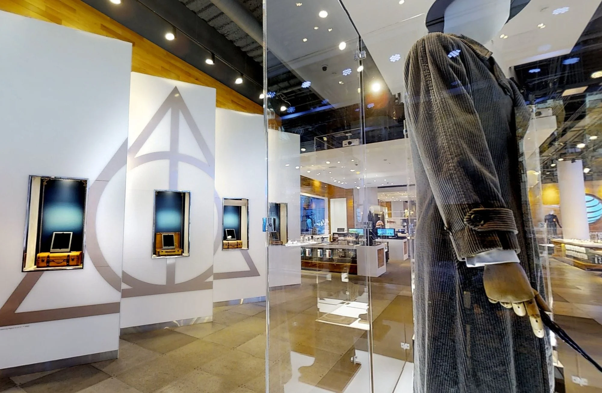
Overview: As a partnership with WB and the Harry Potter franchise, this activation had to create unique fun and engaging entertainment, not just for Wizarding World superfans, but also for broader audiences. And since the venue was AT&T flagship, connectivity via mobile devices had to be front and center.
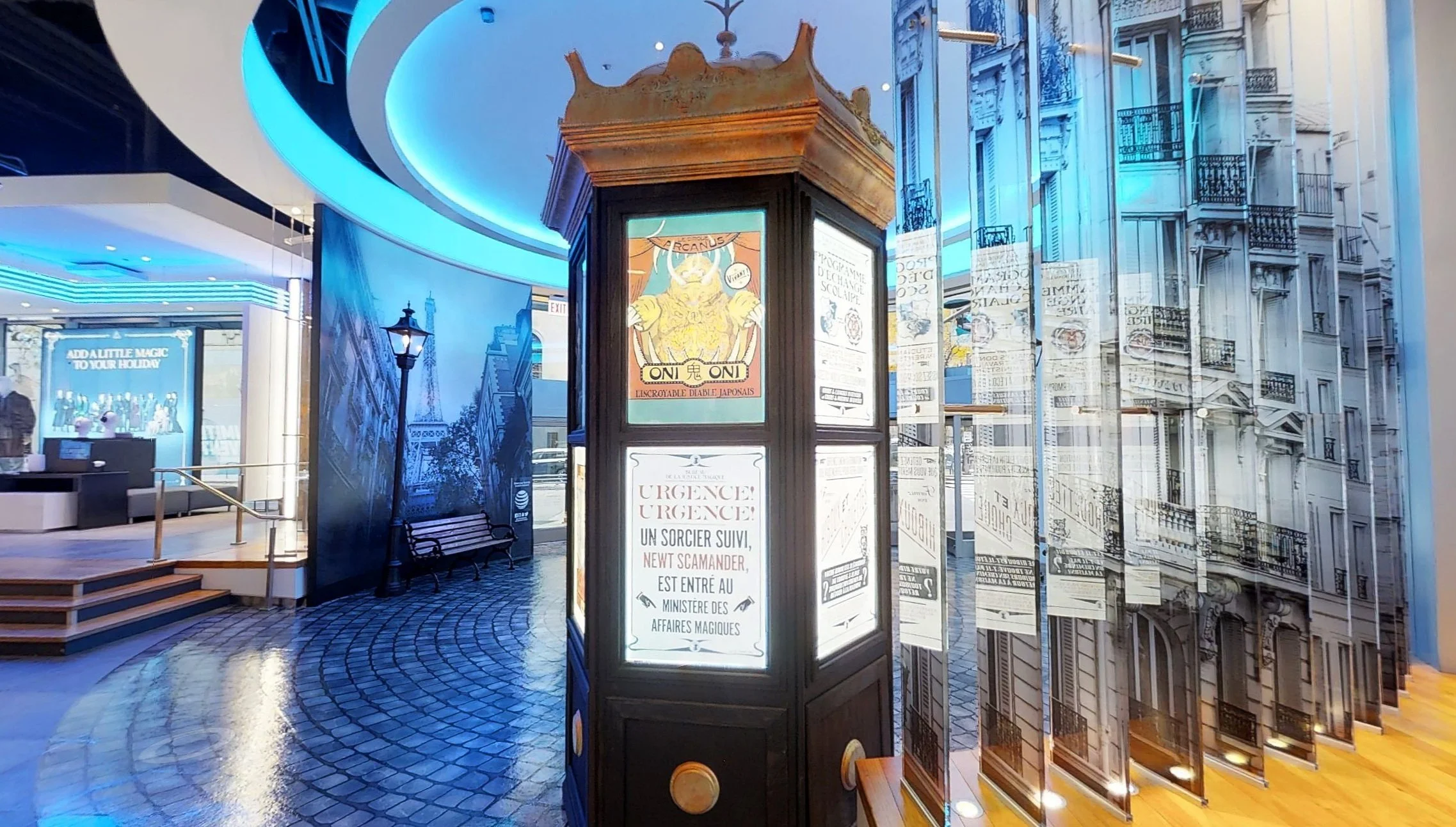
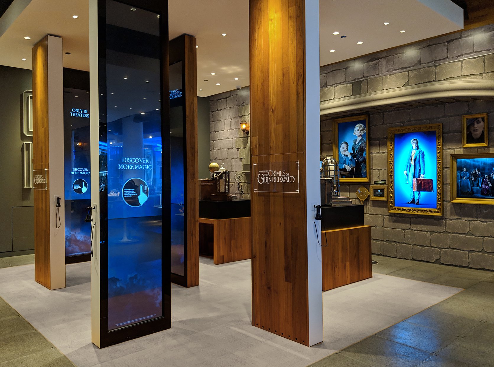
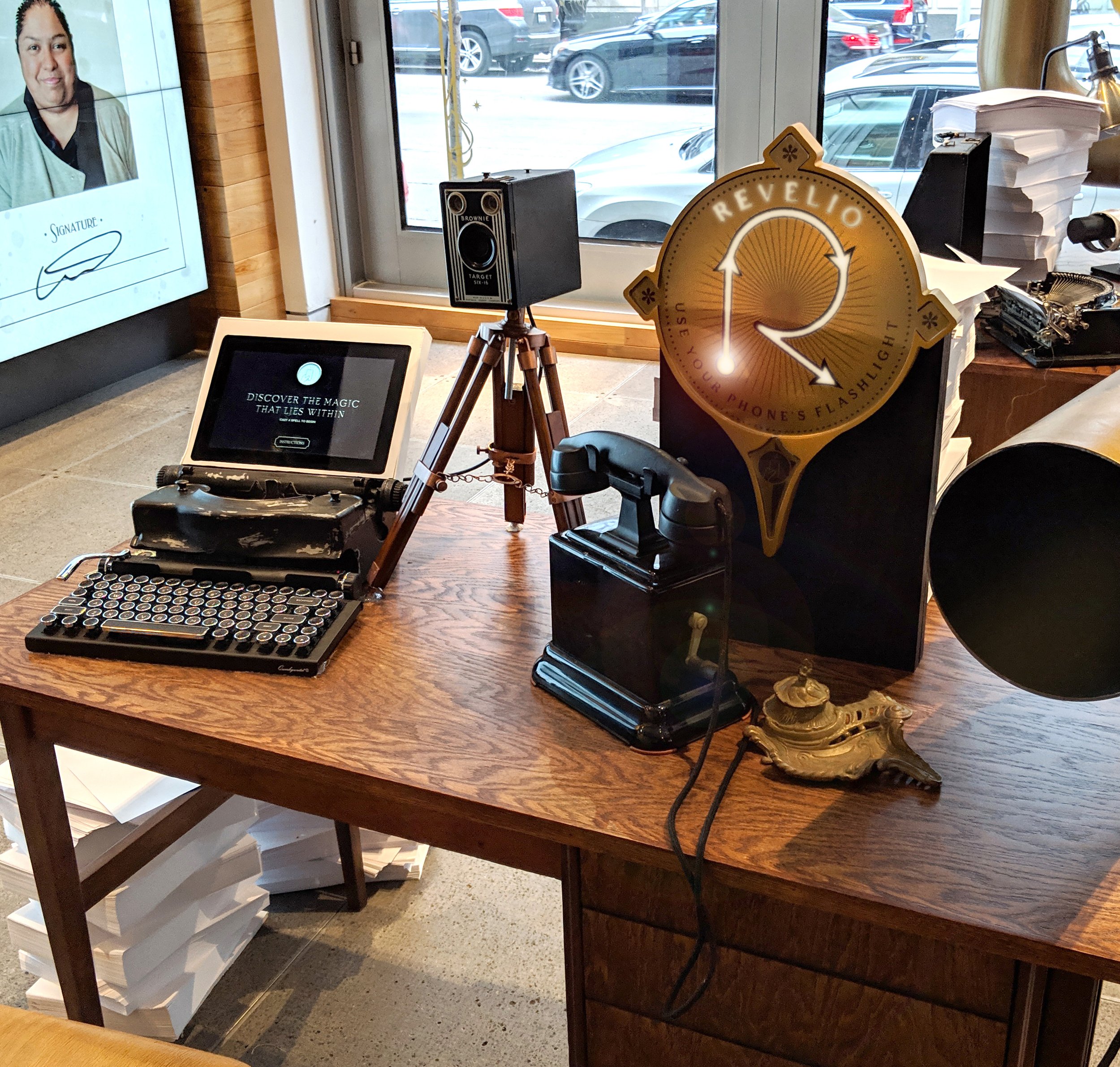
For each of four main experiences, visitors used their phone’s flashlight as a wand to cast spells. Digital sensors captured light and motion, and if done correctly, unlocked more functions and multimedia for the user. Experiences included an interactive Parisian street kiosk with period-inspired digital posters promoting the new film, a magical Newt’s suitcase that revealed holographic animations of your ‘spirit fantastic beast,’ a Travel Bureau where fans could make their own Wizarding World passports, and a gallery of moving portraits where fans could superimpose their own faces onto their favorite characters.
The highpoint of the activation was an evening gala event that coincided with Chicago’s Magnificent Mile Lights Festival. Families and fans of all ages enjoyed live music, fantastical costumed circus performancers, face-painting, balloon art and even a themed parade float.
Other elements of this activation included original costumes and props, a 1920s Paris-inspired selfie moment, exclusive behind-the-scenes content and an AR experience.


-
Client: AT&T
Role: ECD / Creative Director
Scope: Digital interactive design, content development, consumer experience and environment design, graphics and digital media
Agency: Twenty Four 7
Location: AT&T flagships - Dallas, Chicago, San Francisco
Overview: Since 2018 AT&T Dream in Black’s program Black Future Makers supports influencers, entrepreneurs and artists who are transforming culture and making a difference in their communities. We were honored to collaborate with motion graphics artist Handel Eugene to create a collection of digital interactives that celebrate the Black Future Makers of 2023. Each of the experiences invites the user to be part of the content, inspiring them to see themselves in Handel’s work and to directly influence the movement, composition, and complexity of the digital environment. A recording booth also gave the consumers a place to add their voice to the conversation by creating a duet with a Black Future Maker and sharing it via their social channels.


-
Client: American Folk Art Museum
Role: Design Director / Lead Designer
Scope: Lead exhibition planning and design
Agency: Thinc Design
Location: Park Avenue Armory, New York, NY
Size: 55,000 sqft
Overview:
"The show delivers more mind-blowing, optically smashing, time-space-altering exhiliration than anything offered by conventional museum shows." Sir Simon Schama
The exhibition is a grand homage to the boundless creativity of generations of quilters. The collector wished to see all the quilts on display simultaneously, not by pattern, time period, or region, but as a tour de force. The resulting composition is inspired by the geometry, creativity and social nature of community quilting circles, striking a balance between immense quantity and intricate detail.
The exhibition featured 651 quilts on loan from the collection of Joanna S. Rose. The 6-day exhibition set a record for weekly attendance at an Armory show and won numerous awards including AIGA Justified Award, Core 77 Design Award, IDSA IDEA Award, and SEGD Global Design Award. The exhibition was also honored as one of SEGD’s 20 Most Influential Exhibit Designs this Century.
Additionally, the exhibition was featured in numerous popular media outlets such as Hallmark Channel's The Martha Stewart Show, PBS's TV series Sunday Arts, the Wall Street Journal, the Financial Times and The NY Times T Magazine.




-
Client: Cooper Hewitt, Smithsonian Design Museum
Role: Design Director / Lead Designer
Scope: Exhibition planning and design
Agency: Thinc Design
Location: New York, NY
Size: 6,500 sqft
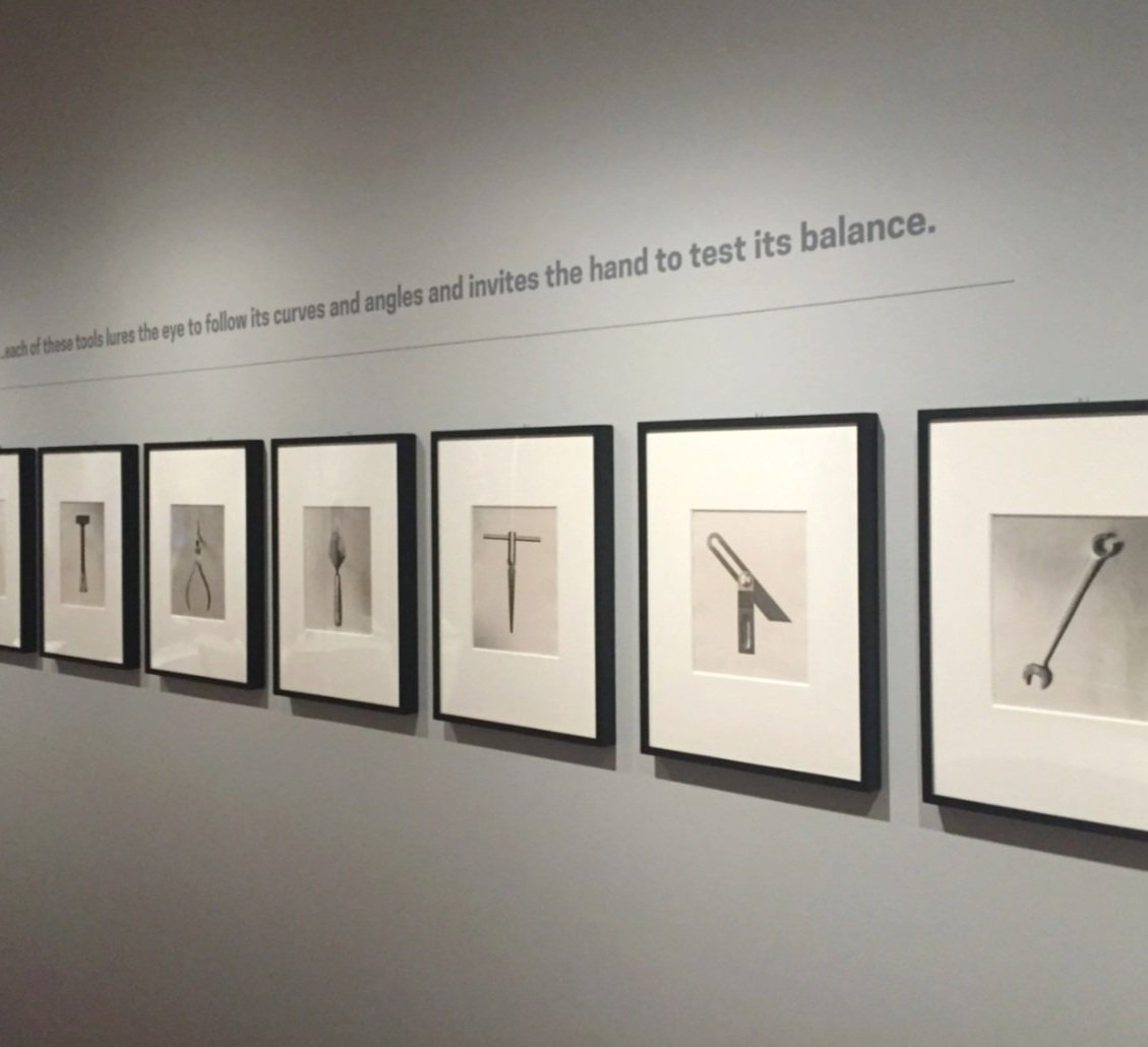
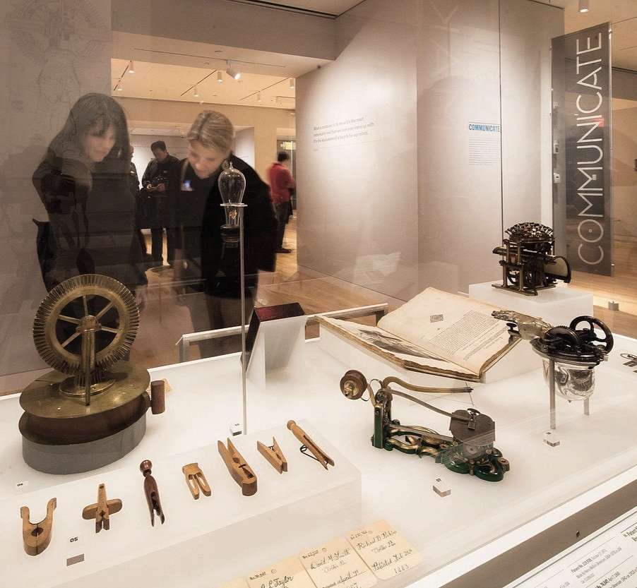
Overview: Tools: Extending Our Reach is part of the inaugural exhibitions celebrating the museum’s reopening after an extensive 3-year renovation and rebranding. The exhibition includes 175 objects selected from Cooper Hewitt and 9 other Smithsonian collections. 1.85 million years of tool use and design is represented.
The exhibit narrative considers the fundamental role that tools play in shaping our lives. Six thematic categories (work, measure, communicate, observe, make, and survive) organize the collection, highlighting human creativity and illustrating how tools extend our human body, our senses, and our capabilities. The design creates a neutral stage for the objects and artifacts to be appreciated on their own merits, without hierarchy and with only minimal context and interpretation. The exhibition also included the large-scale installation, Controller of the Universe (2007), by artist Damian Ortega.
Tools: Extending Our Reach is the winner of the Dibner Award for Excellence in Museum Exhibits, awarded by the Society for the History of Technology.


-
Client: Breville USA
Role: Creative Director
Scope: Content and design of website
Agency: Twenty Four 7
Overview: After working on the reimaging of Breville’s shop-in-shop program as an experience-led collection of product stories, we were asked to bring the same narrative-driven thinking to Breville’s holiday e-com website. The new microsite’s main feature was that it curated gift suggestions based on personalities of gift recipients. The design was more than just a gift guide though. It also offered a myriad of creative gift wrapping tips, and popular recipes from holiday celebrations around the world.




-
Client: Seattle Metropolitan Credit Union (SMCU)
Role: ECD / Creative Director
Scope: Rebranding, brand guidelines, signage, retail and marketing strategies and store/branch design
Agency: Twenty Four 7
Location: Seattle, Washington
Overview: As SMCU approached their 84th year of service, Seattle’s financial landscape was changing rapidly, becoming fast-paced and hyper-competitive. To keep up, SMCU knew they needed to develop new ways of doing business and deliver compelling customer experiences across all their consumer touchpoints.
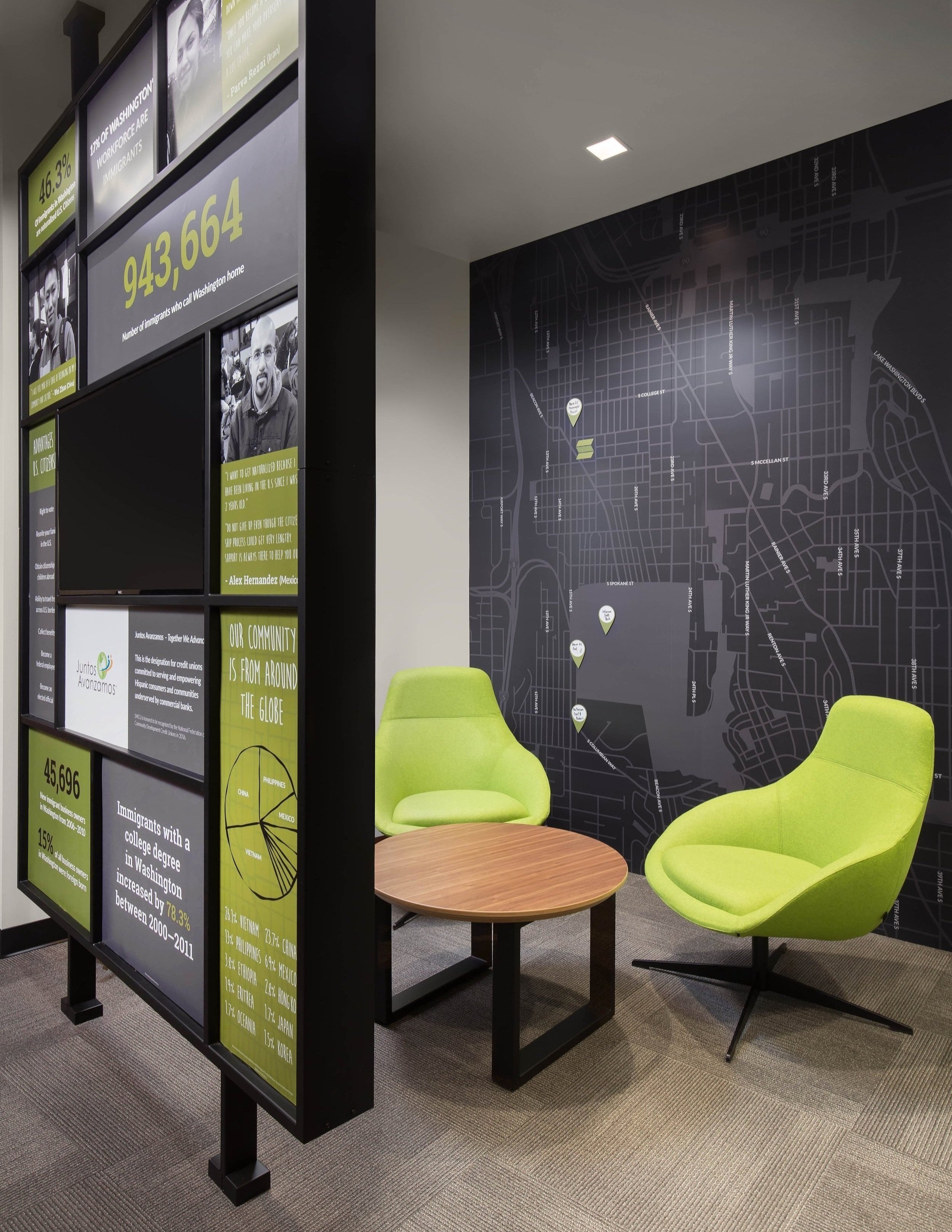
Our approach to this imperative project centered on a credit union’s relationship with their customers and with the communities they serve. This owner/member/neighbor egalitarian dynamic shaped every aspect of the project, from the selection and arrangement of the furniture, to the content curation of graphics and digital media, to messaging refinements deployed in all consumer-facing marketing and face-to-face interactions.
Today’s consumer conducts most of their financial business online. When they visit a local branch, they’re often looking for more than transactional services. They need education about their financial status, advice about their future, community support and meaningful interactions with their financial partner. To meet these needs, the design team had to re-think decades-old service models. Traditional teller lines were replaced with self-serve technology. Desks and ‘executive chairs’ were swapped out for round tables and homogenous seating. Big, impersonal conference rooms and designated associate offices were eliminated in favor of communal spaces and semiprivate areas conducive to genuine conversations. And in place of traditional advertisements, environmental signage now provides useful, informative content featuring local, personal and inspirational stories.
The most significant component of this rebranding project was changing SMCU’s name to Seattle Credit Union. A brand audit supported this decision, showing the need to build better brand recognition and retention, and leading us to position the institution, in the consumer’s eye, as “Seattle’s” credit union.




-
Client: AT&T
Role: ECD / Creative Director
Scope: Digital interactive and game design, content development, consumer experience and environment design, activation identity, graphics and digital media
Agency: Twenty Four 7
Location: AT&T flagships, Chicago & San Francisco
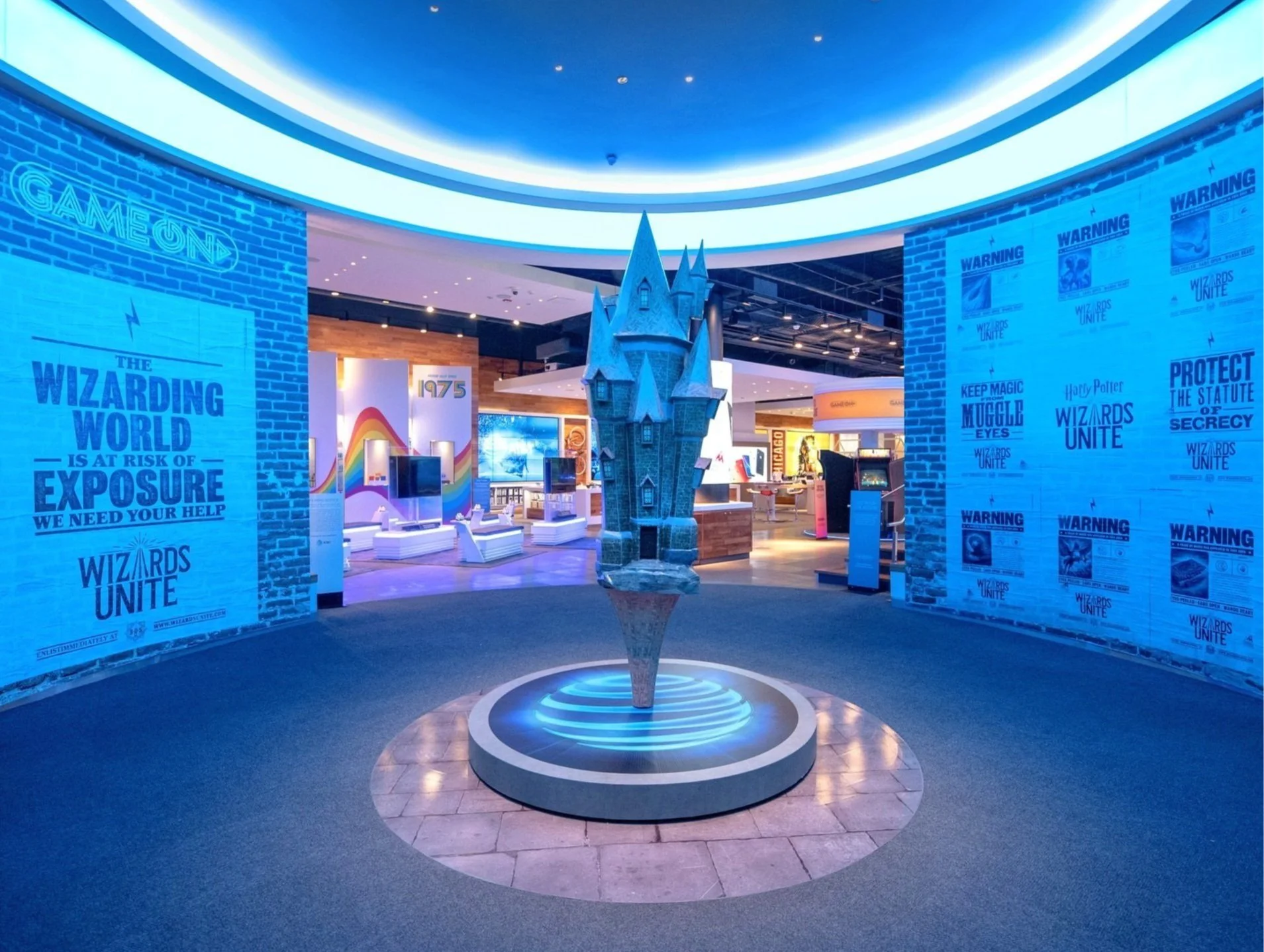
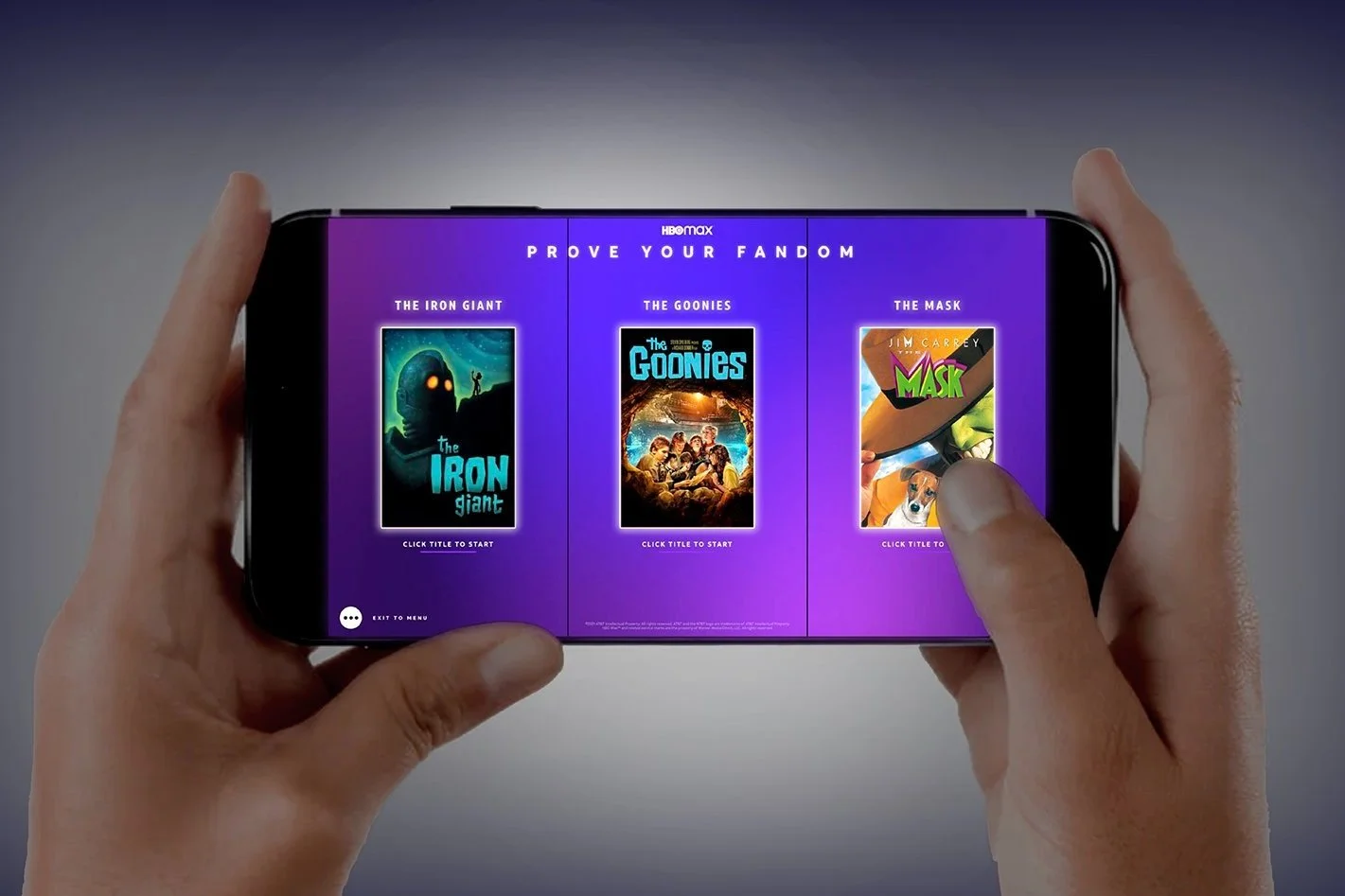
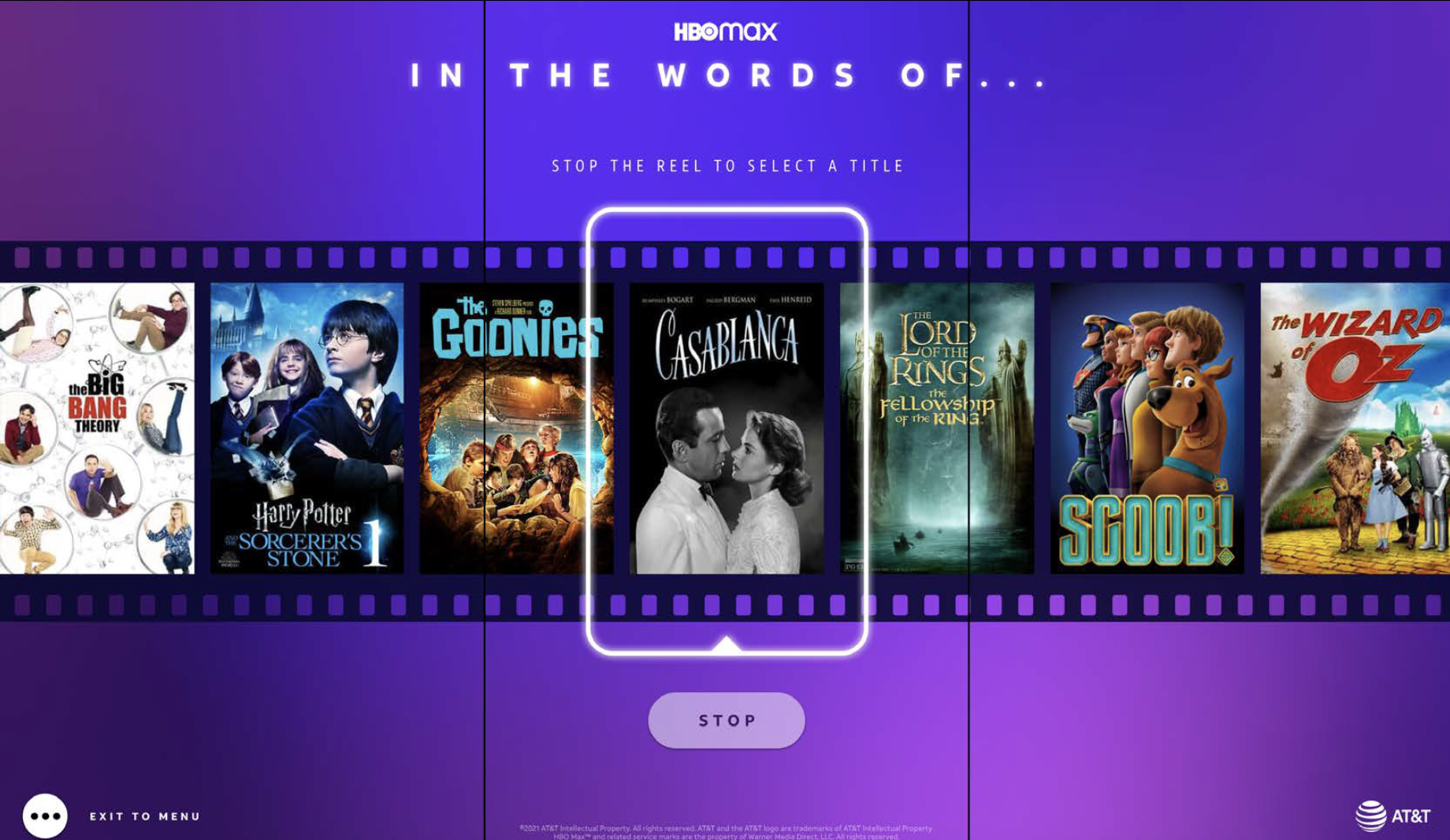
Overview: Game On celebrated gamers and digital gaming. The summer-long activation turned AT&T’s flagship into an arcade-like destination where consumers of all interest levels could try the latest games, like NBA 2K, enjoy old favorites like Pac Man, compete in an exclusive high-score game, discover Wizarding World via the Wizards Unite mobile AR game, explore the history of gaming and more – all while experiencing AT&T’s fastest network services.
This wide range of experiences was driven mostly by the diversity of the gaming community, but also to give the consumer-at-large discoverable paths to find personal interests within the gaming theme. Nostalgia, popular IPs, competition, innovation technologies and familiar gaming hardware all factored into the design and curation of experiences.
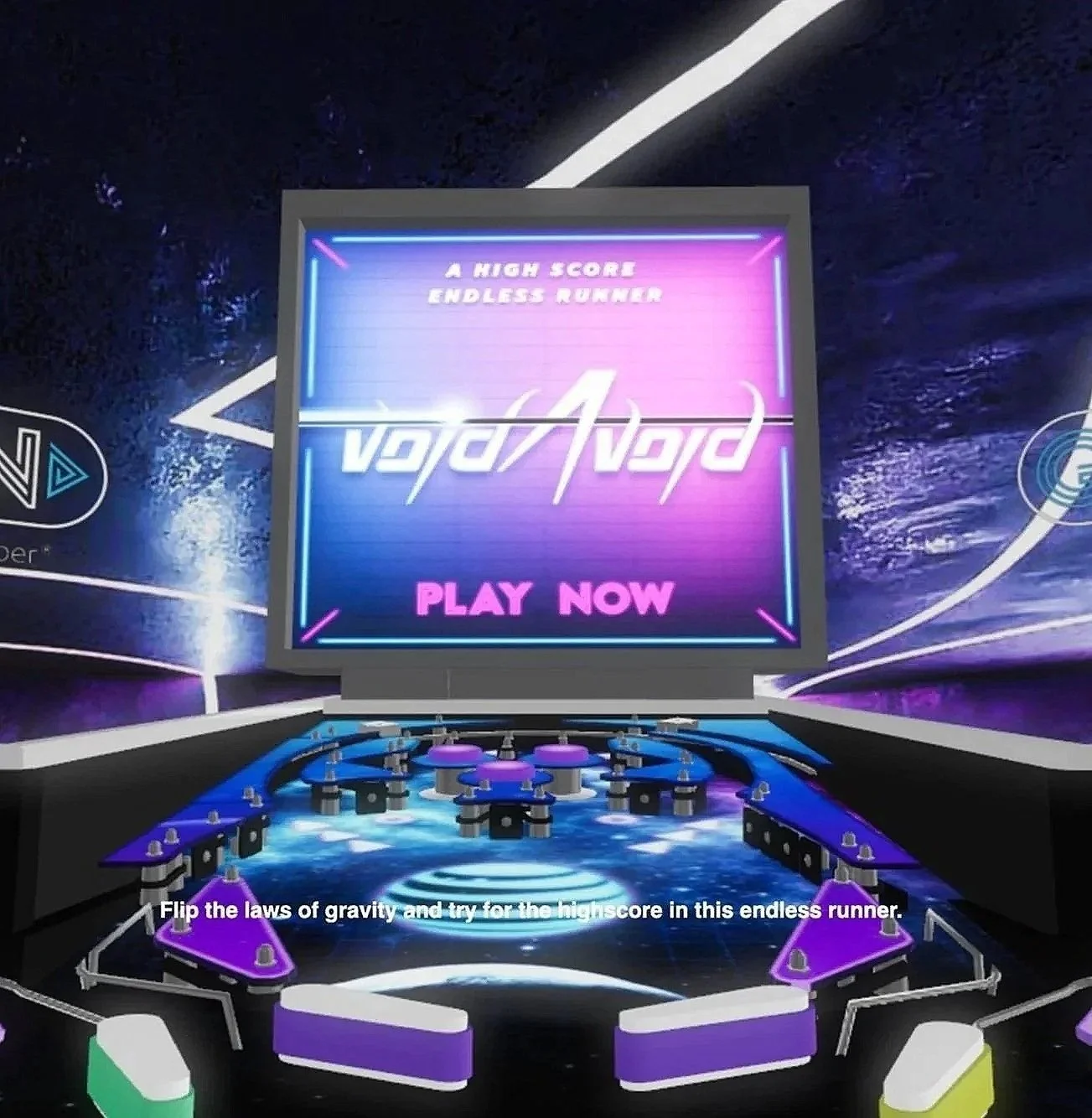
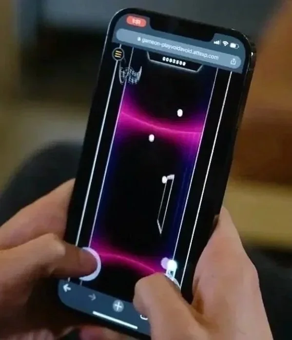
For the intra-store high-score competition we designed and developed an entirely new endless runner game, Void Avoid. The debut iteration featured a custom arcade cabinet format. The game was re-introduced in a mobile format as part of our ATTEXP.COM project.




-
Client: AT&T
Role: ECD / Creative Director
Scope: Digital/mobile experience and game design, in-store interactive experience and game design, themed environment design, graphic and digital media
Agency: Twenty Four 7
Location: AT&T flagships - Chicago, Dallas, San Francisco
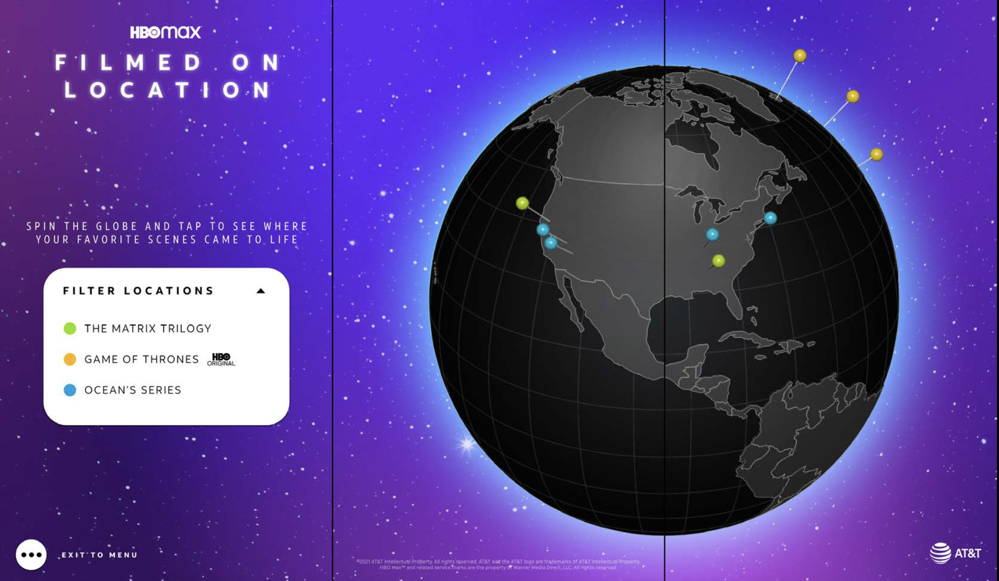
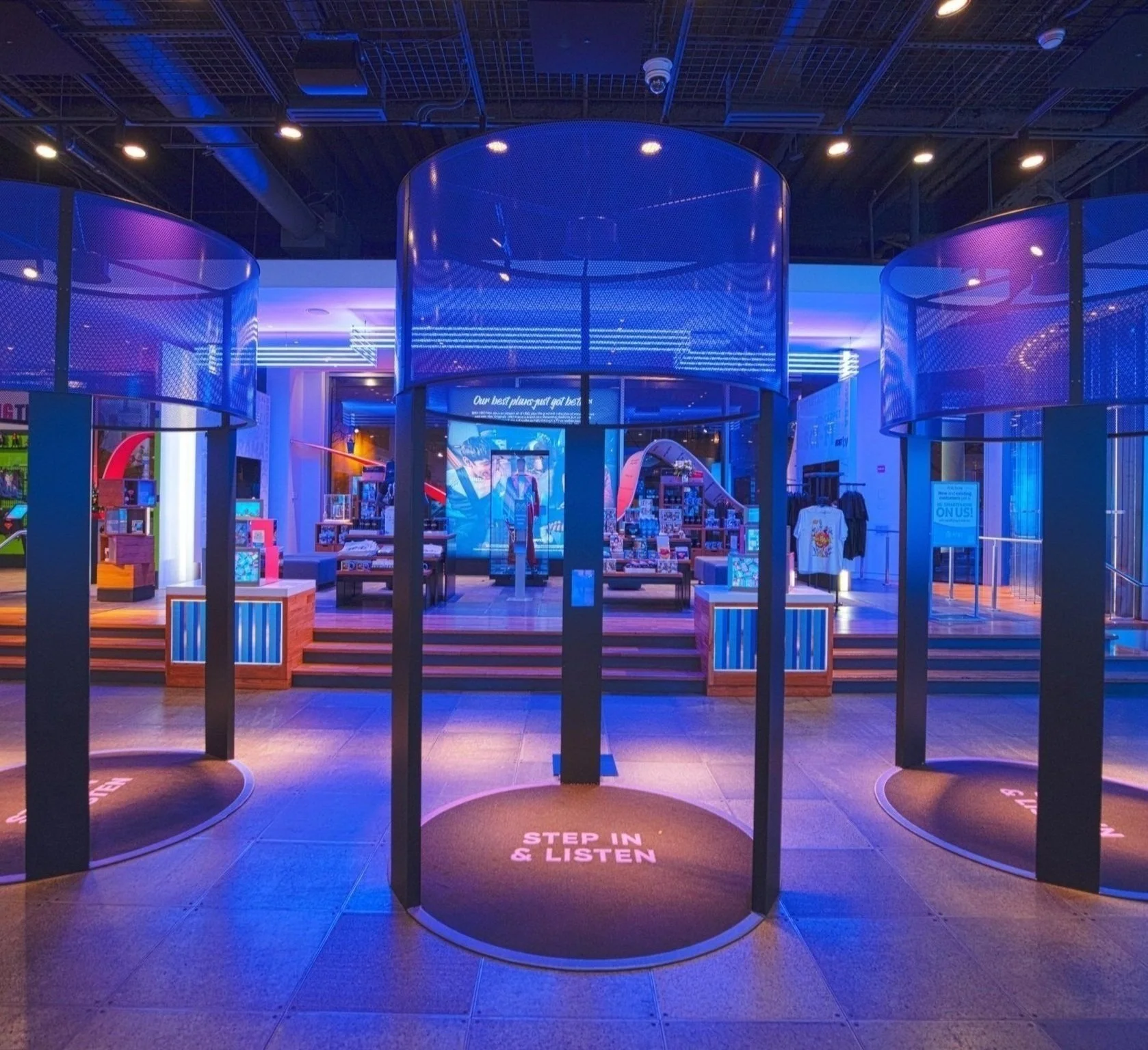
Overview: As the retail and entertainment world was beginning to re-open after strict COVID measures, WB offered new movie releases on their streaming service, HBO Max (now Max), the same day they premiered in theaters. AT&T then wanted to co-promote an offer that included HBO Max on their unlimited mobile plans.
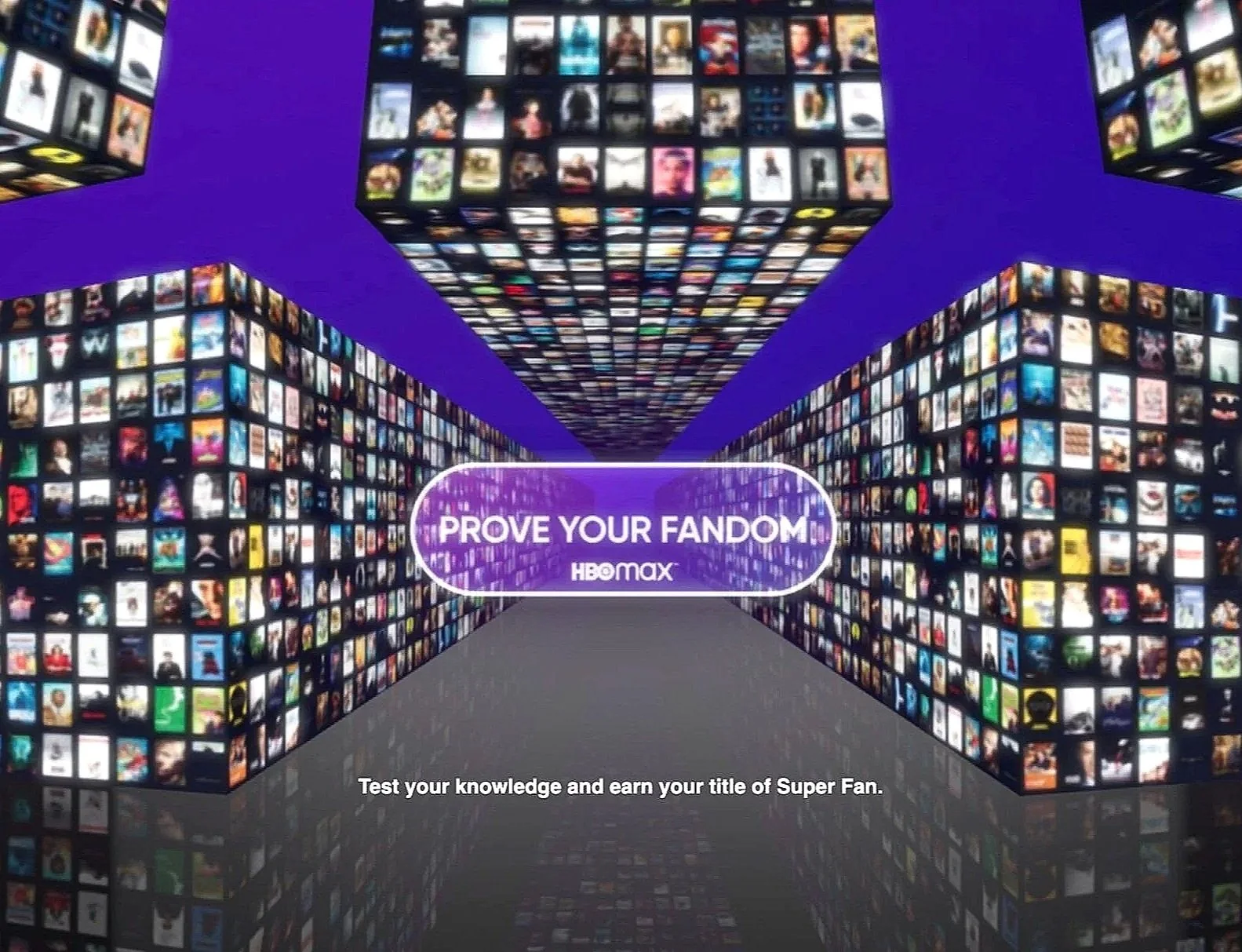
To support this, Twenty Four 7 was asked to create a suite of in-store and mobile experiences that would express the campaign’s unique value proposition and also capture the excitement of popular shows and movies that streamed on HBO Max. The resulting activation included: a campaign-themed Watch Lounge, a recreation of The Big Bang Theory’s iconic comic book shop, and numerous digital games and experiences for mobile.




-
Client: TED Talks and Mission Blue
Role: Design Director / LeadDesigner
Scope: Stage set design
Agency: Thinc Design
Location: Monterey, CA and Galapagos Islands, Ecuador
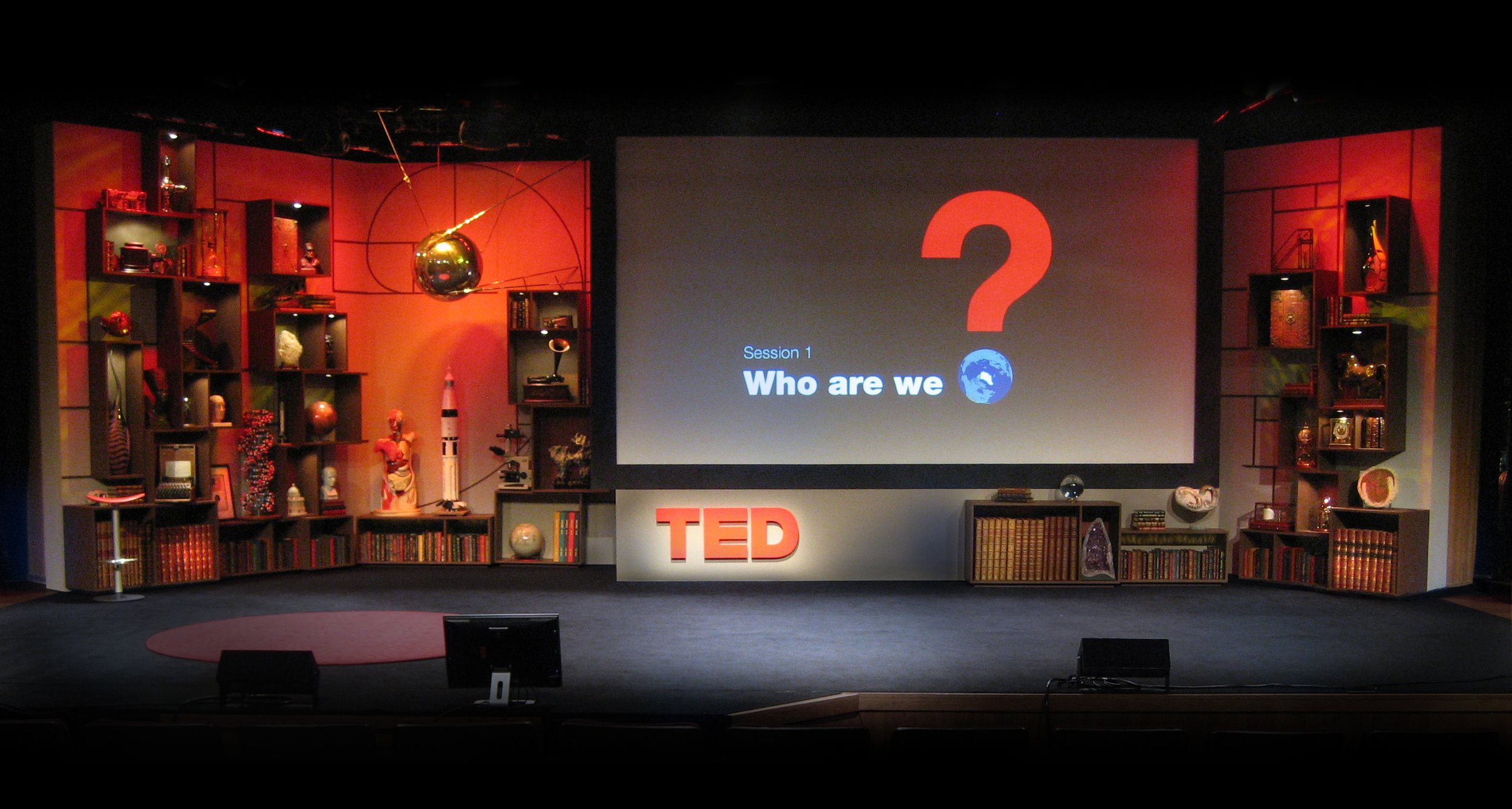
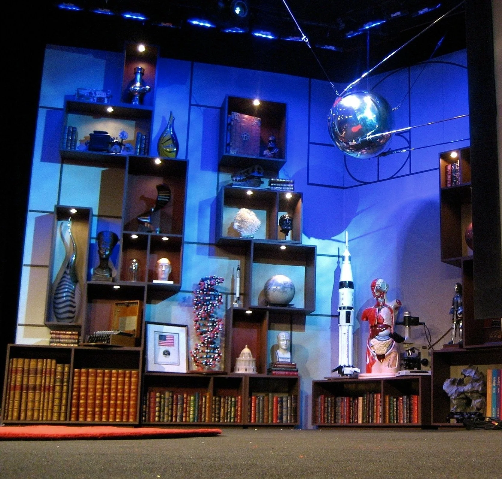
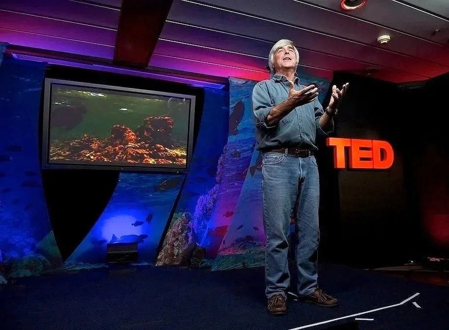
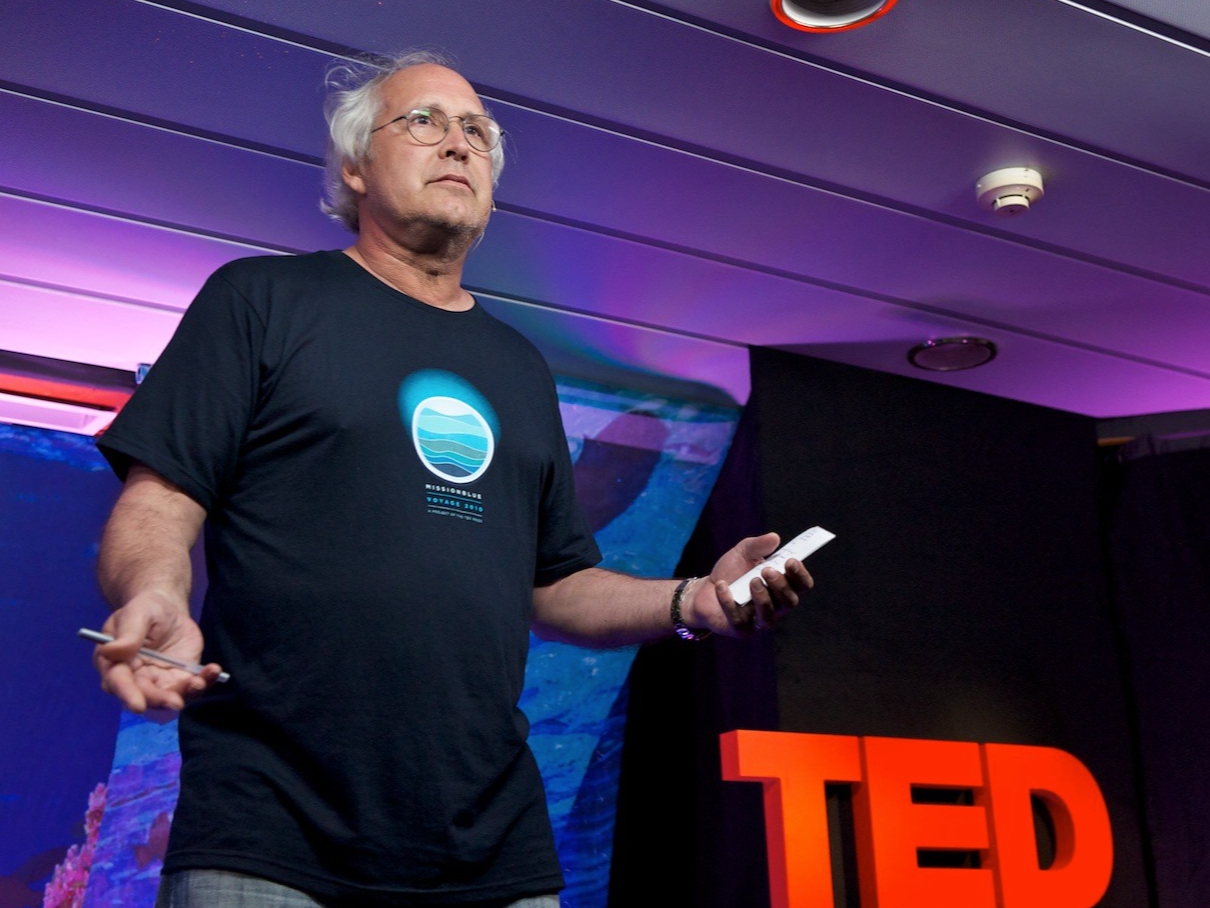
Overview: After having worked with TED on the stage set for their final appearance in Monterey, I was honored to partner with them again to design an intimate stage for TED Ocean and Mission Blue. This event was inspired and organized by the iconic ocean explorer Sylvia Earle to “ignite public support for a global network of Marine Protected Areas.”
The multi-day event was hosted aboard the National Geographic Endeavor and brought together over 100 global leaders, scientists, policy makers and well-known ocean advocates including Jean-Michel Cousteau, Chevy Chase and Glen Close.




-
Client: AT&T
Role: ECD / Creative Director
Scope: Store/retail design, digital interactive design, content development, consumer experience and environment design, graphics and digital media
Agency: Twenty Four 7
Location: AT&T flagship, San Francisco
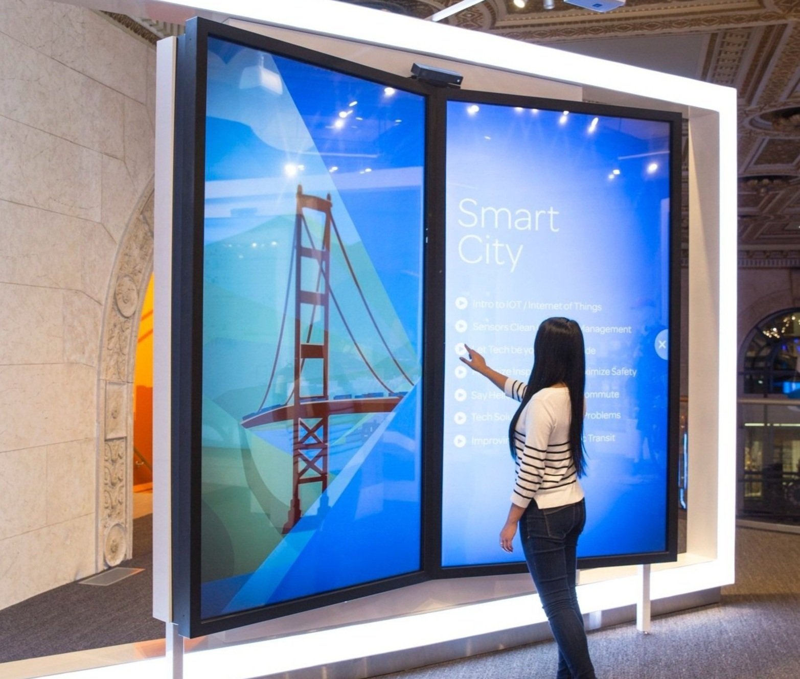
Overview: Connected Life is an interactive, immersive showcase of IoT technology. At the time of its launch, most consumers did not understand the innumerable ways that new technology was rapidly connecting everything in our lives. AT&T saw a real need to be a hub of information and to inspire consumers to see the possibilities of IoT to enable and empower their lives.
Content development focused on storylines that were simple, personal and localized. The design features domestic, real-life examples presented in familiar environments and everyday scenarios. Distinct smart-home areas let consumers explore connected appliances, connected entertainment, safety and security products, complete home monitoring and control systems, a connected car, a connected bicycle, and connected health and well-being products. Additionally, a series of large touchscreens, arranged like huge open books, allow users to experience the full scale of a connected life.
Connected Life won two Shop! Design Awards, an Addy, and the Rosey Award.


-
Client: Sharp Electronics Corporation
Role: Design Director / Lead Designer
Scope: Exhibition Design, Theme Tagline and Content Direction
Agency: Thinc Design
Location: CES, Las Vegas, Nevada
Size: 10,000 sqft
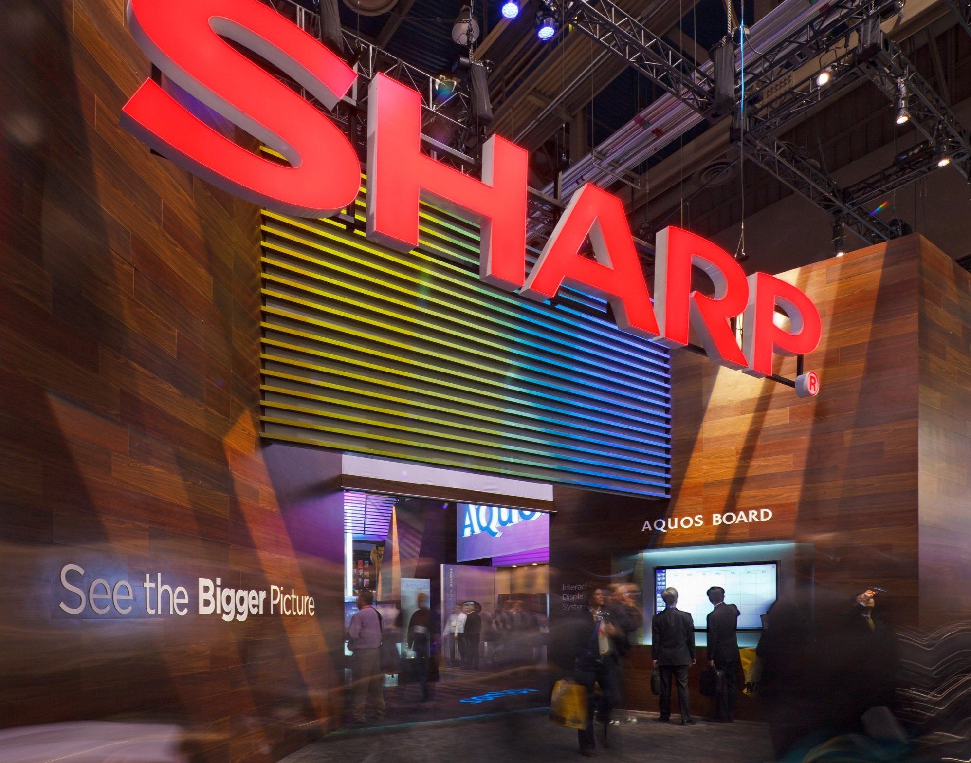
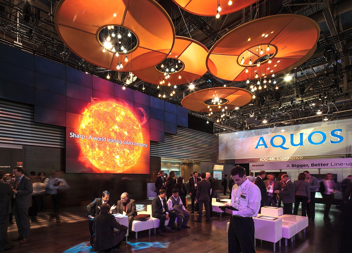
Overview: Sharp’s main objective was to refresh their brand image and to differentiate Sharp from their competitors at the Consumer Electronics Show (CES). Our approach was to shift the marketing focus away from the usual CES arms race of the biggest and thinnest TVs to a more encompassing, emotionally-charged value proposition – one that recognized that the consumers’ imaginations, their purchase decisions and their brand loyalty are motivated by much more than specifications of inches and pixels.
See the Bigger Picture was an invitation.
See the Bigger Picture was about how our televisions, monitors and device screens are windows to the world. Through the screen, one travels the globe, explores interests, learns, discovers, connects with others and expands knowledge. Digital content supported this vision with slow-motion vistas of sweeping landscapes from around the globe, juxtaposed with intimate, close-up moments of colorful human interaction.
The exhibit was designed to be a welcoming beacon. The layout was open along the entire length of the main aisle. Illumination was used to frame views into the exhibit space, to elevate product and to highlight prominent messaging. In addition, wood was used as a primary finish, creating a warm and confident gesture that was unconventional amongst the tech-dominated architectures of CES.


-
Client: International Centre for Integrated Mountain Development (ICIMOD)
Role: Design Director / Lead Designer
Scope: Exhibition Planning and Design
Agency: Thinc Design (in collaboration with David Breashears’ GlacierWorks and the ICIMOD)
Location: Kathmandu, Nepal
Size: 1,000 sq meters
Overview: The Climate + Change exhibition was part of an initiative that encourages cooperation and knowledge exchange across the Hindu-Kush Himalayan region where communities are experiencing disaster-related impacts of climate change.
The exhibit featured David Breashears’ vast panoramic photography along with stories of adaptation and change from mountain communities. The exhibit also functioned as a venue where scientists, officials, students, and urban and rural people came together for dialogue, workshops, and creative expressions of a changing human and physical landscape.


-
Client: Museum of Science and Industry
Role: Design Director
Scope: Exhibition planning and design
Agency: Thinc Design
Location: Chicago, IL
Size: 15,000 sqft
Overview: The name says it all. The exhibit puts the visitor, you, at the center of the content, requiring user input, touch and motion to activate the experiences. Visitors learn, not just about human biology, but about how their life decisions impact their bodies and their minds. As they look at themselves from a different perspective, visitors are inspired to consider real-life challenges in relation to their health and well-being. The exhibit includes social games, anatomy and health-related artifacts, a hands-on operating room simulation, and numerous self-directed activities for fun exploration and discover.
One of my main roles was to pull the projects’ diverse galleries and experiences together under a coherent visual umbrella. A collection of simple shapes with bold, color-coordinated graphics creates elegant ‘shelters’ that provide intimate spaces for individual and small group activities. The scale and composition of these structures also fulfill a role as billboards within the context of their prominent location – an open mezzanine in the museum’s grand Beaux-Arts hall.
You! The Experience is the recipient of the THEA Award for Outstanding Cultural Achievement.




-
Client: Discover Park of America
Role: Design Director
Scope: Exhibition planning and design
Agency: Thinc Design (in partnership with Maltbie and Verner Johnson and Associates)
Location: Union City, TN
Size: 52,000 sqft
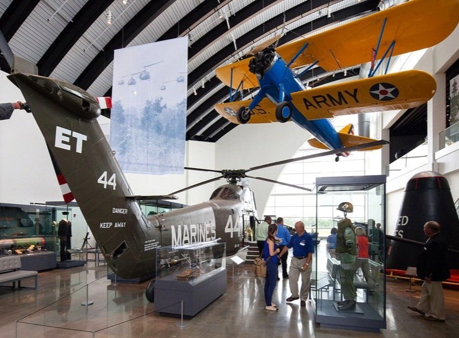
Overview: The Discovery Center was the vision of Robert and Jenny Kirkland, who wanted to share their experiences of traveling the world with the people of their home town.
My team began the project with this broad objective and an eclectic collection of rare and diverse items that the Kirklands had acquired over the years. The task of crafting the programming goals for nine themed galleries, curating the collections, and creating an entire museum experience from scratch was enormous. Our close collaboration with the Center’s inexperienced but dedicated staff was essential in developing and designing the educational and recreational experiences rarely available outside of big cities.
The galleries include natural history, regional history, space science, alternative energy, military history, and Native American cultures. Exhibit highlights include an earthquake simulator, an interactive, digital planetarium, 3d hologram story-telling, numerous dinosaur skeleton replicas, learn-by-play areas for children, and a giant slide-through human body sculpture.
